Visual & Image
Color & Grading
Complementary, analogous, teal and orange, Morandi — one palette word locks in the tone of the whole frame.
12 terms
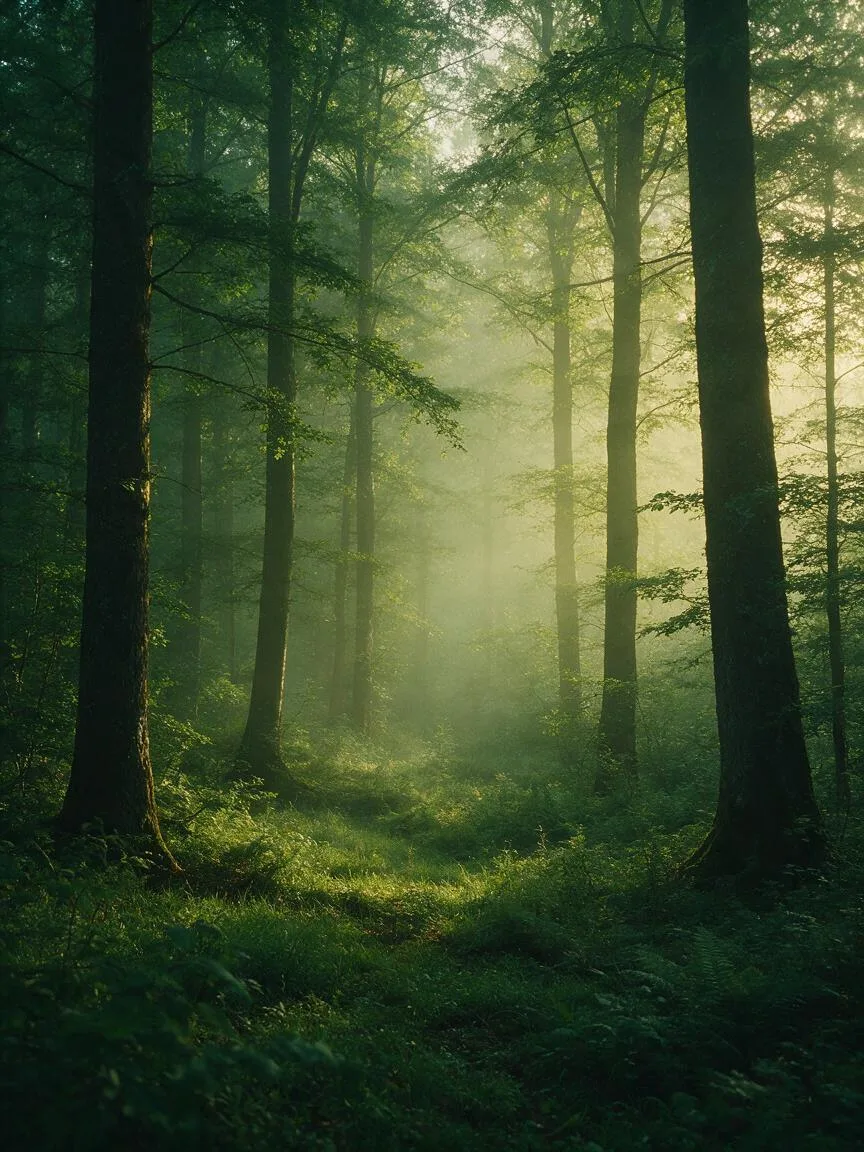
Analogous Colors
A color scheme that selects 2 to 5 adjacent colors on the color wheel, creating a highly harmonious, unified, and visually non-conflicting tonal foundation.

Complementary Colors
A combination of two colors positioned 180 degrees apart on the color wheel, using extreme color contrast to strengthen visual focus and image tension.
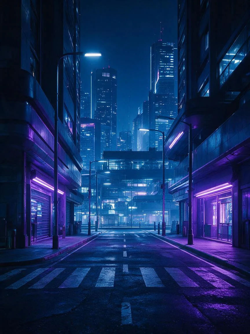
Cool Colors
A color tendency dominated by shorter-wavelength colors such as blue, green, and purple, conveying calmness, technology, melancholy, or mystery.
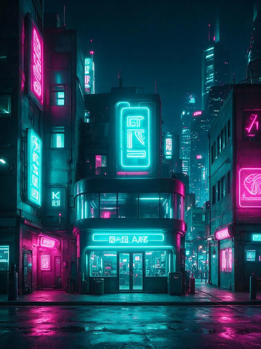
High Saturation
A visual characteristic defined by high color purity and minimal gray components, using vivid and intense colors to enhance the visual impact of an image.
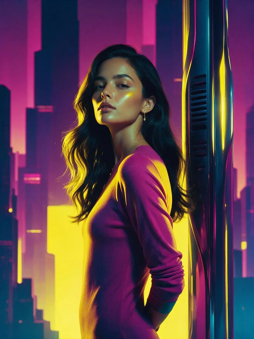
Limited Color Palette
A color control technique that strictly limits the types and range of colors in an image to enforce a unified overall tone and eliminate stray colors.
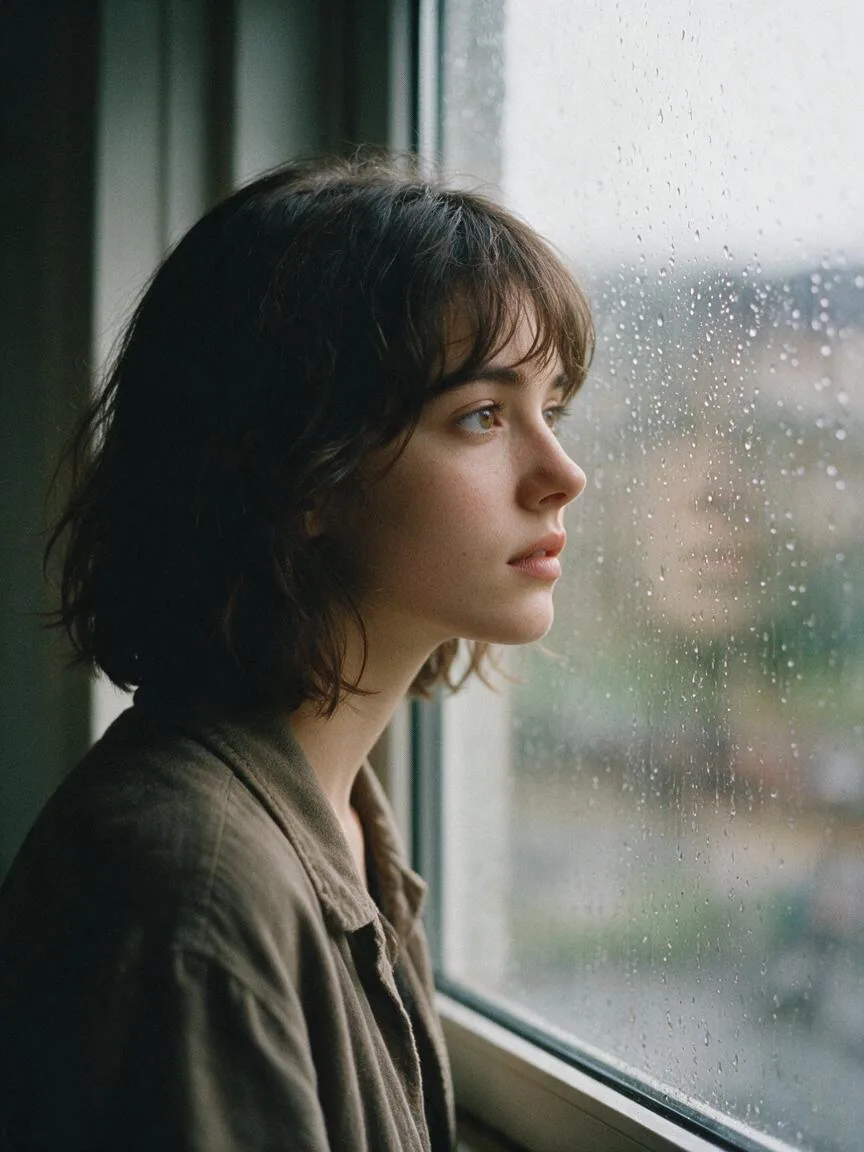
Low Saturation
A color grading technique that reduces color purity and visual stimulation, shifting colors toward gray to create a restrained, sophisticated, or nostalgic mood.
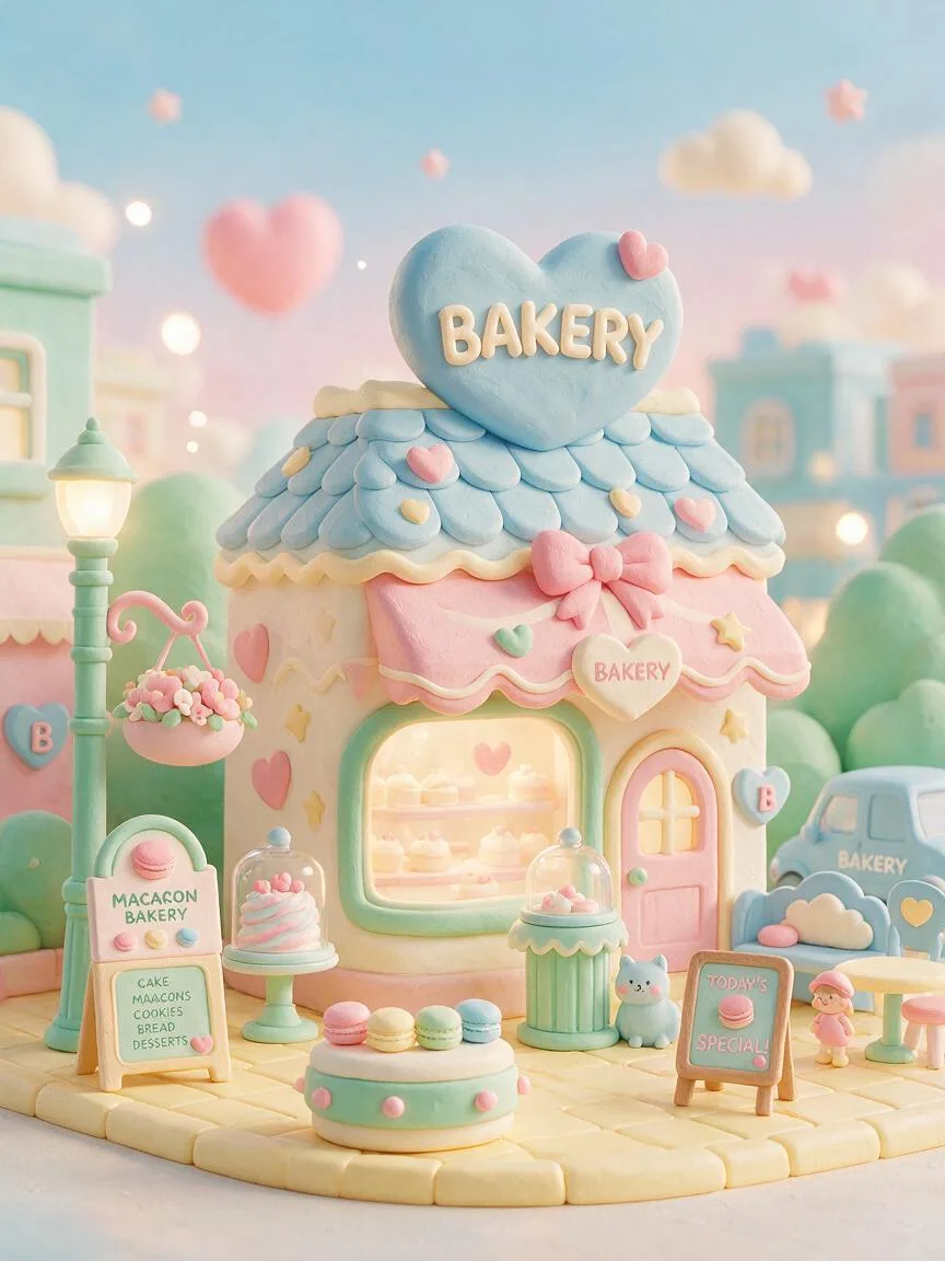
Macaron Colors
A soft color scheme with high brightness, low saturation, and a pastel texture. It creates a light and sweet visual atmosphere by reducing color purity and increasing brightness.
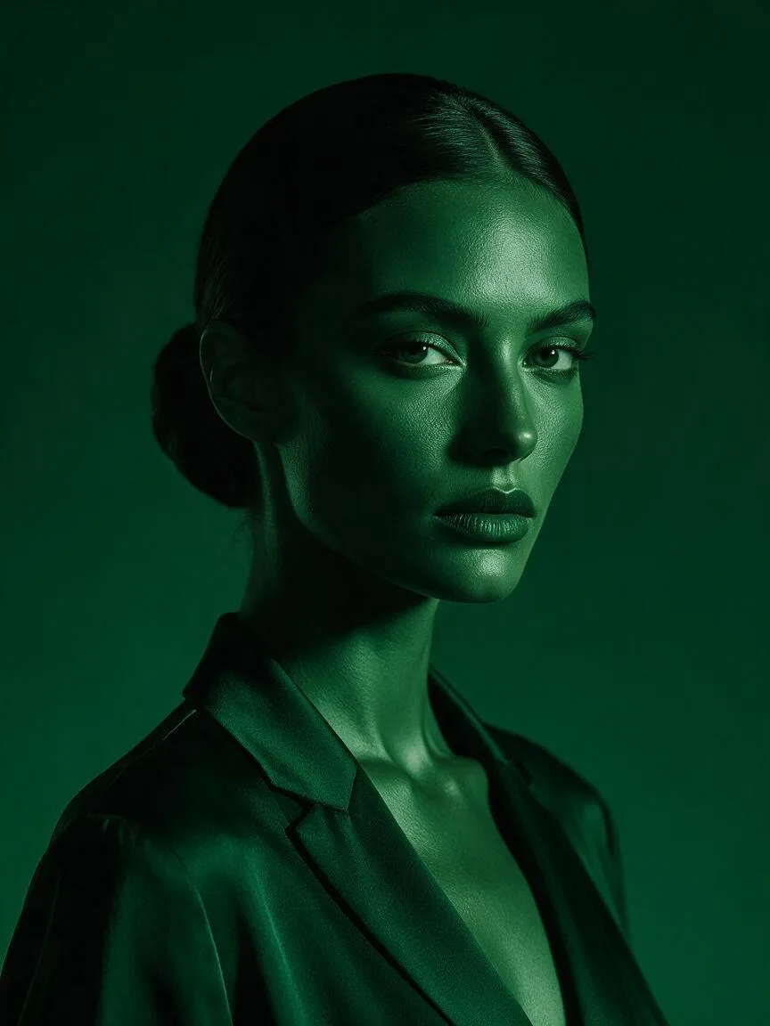
Monochromatic
A color rendering technique that builds an entire image using only a single hue and its variations in lightness and saturation.
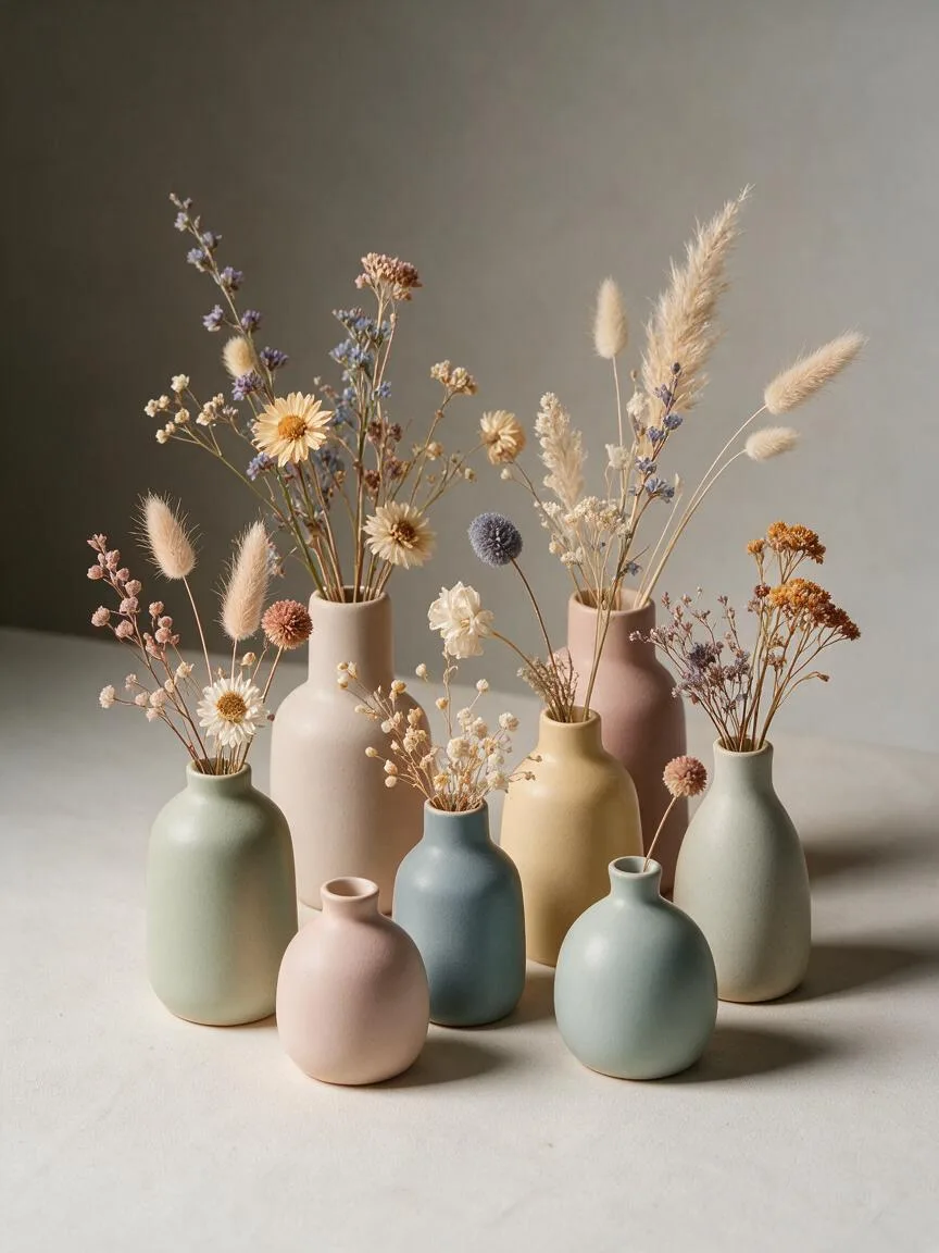
Morandi Colors
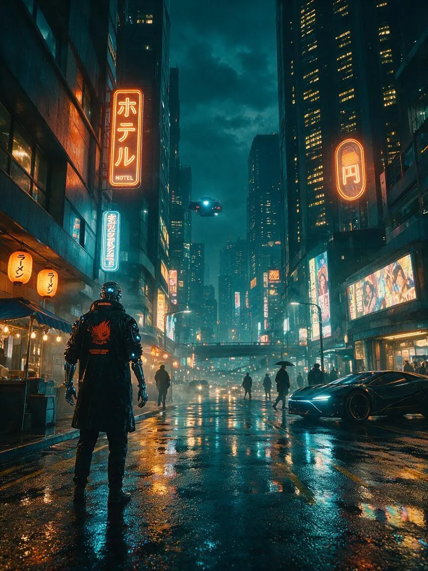
A low-saturation, grayish soft color system originating from the works of Italian painter Giorgio Morandi, used in AI visual creation to create a calm, restrained, and premium visual atmosphere.
Split-Complementary Colors
A color scheme consisting of a base color and the two colors adjacent to its complement, combining high contrast with visual harmony.
Teal and Orange
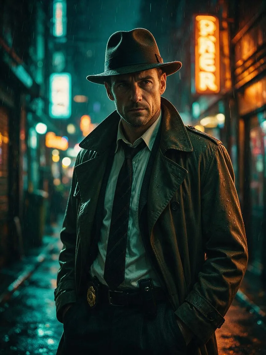
A classic cinematic color grading style that pushes shadows toward teal and highlights toward orange, using strong cool-warm contrast to make the main subject stand out.
Warm Colors
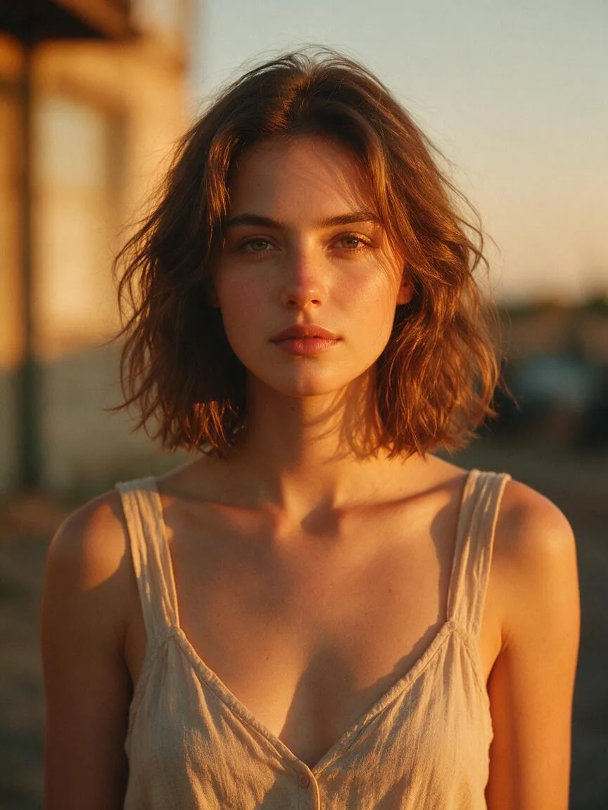
A color tendency dominated by reds, oranges, yellows, and their derivatives, used to evoke warmth, vitality, or nostalgia.