Morandi Colors
Morandi Colors Morandi Color Scheme Morandi Color Palette Morandi Tones Muted Tones
Color & GradingA low-saturation, grayish soft color system originating from the works of Italian painter Giorgio Morandi, used in AI visual creation to create a calm, restrained, and premium visual atmosphere.
Also known as: Morandi Color Scheme · Morandi Color Palette · Morandi Tones · Muted Tones
- Midjourney
- Kling
- Sora
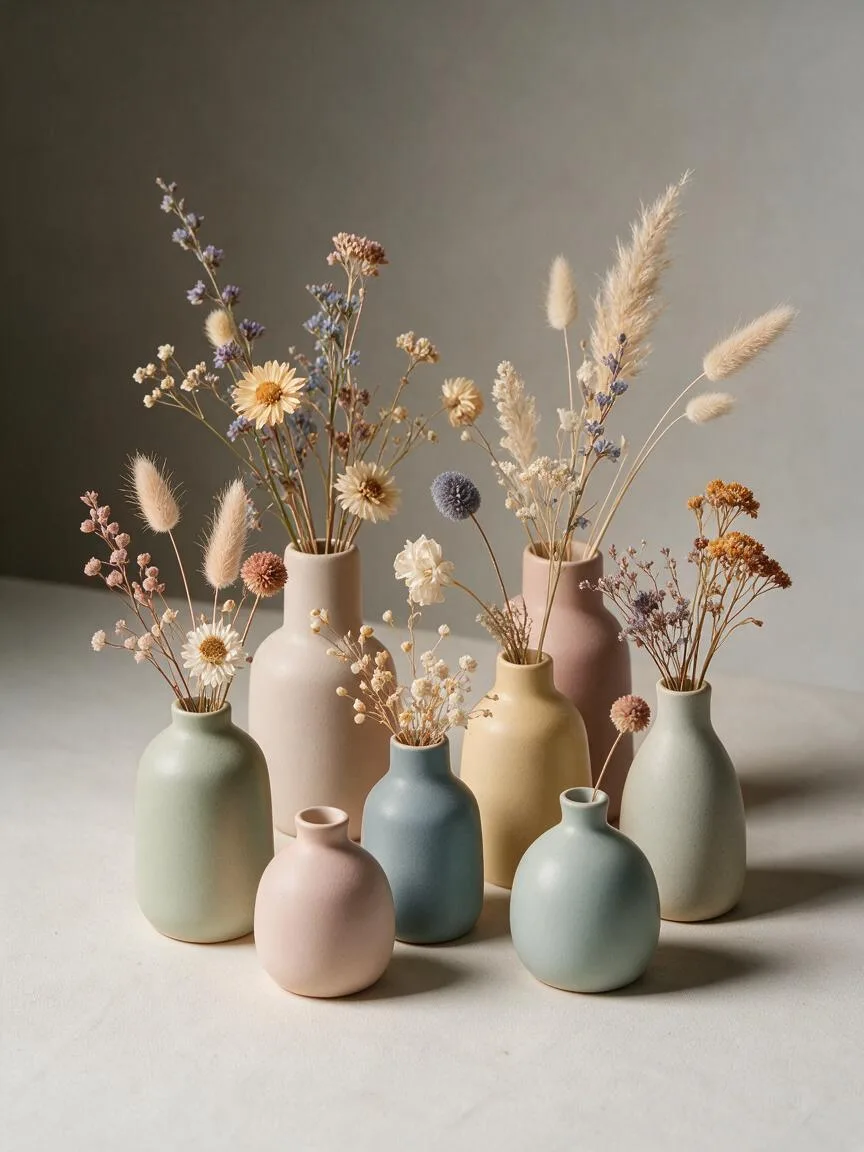
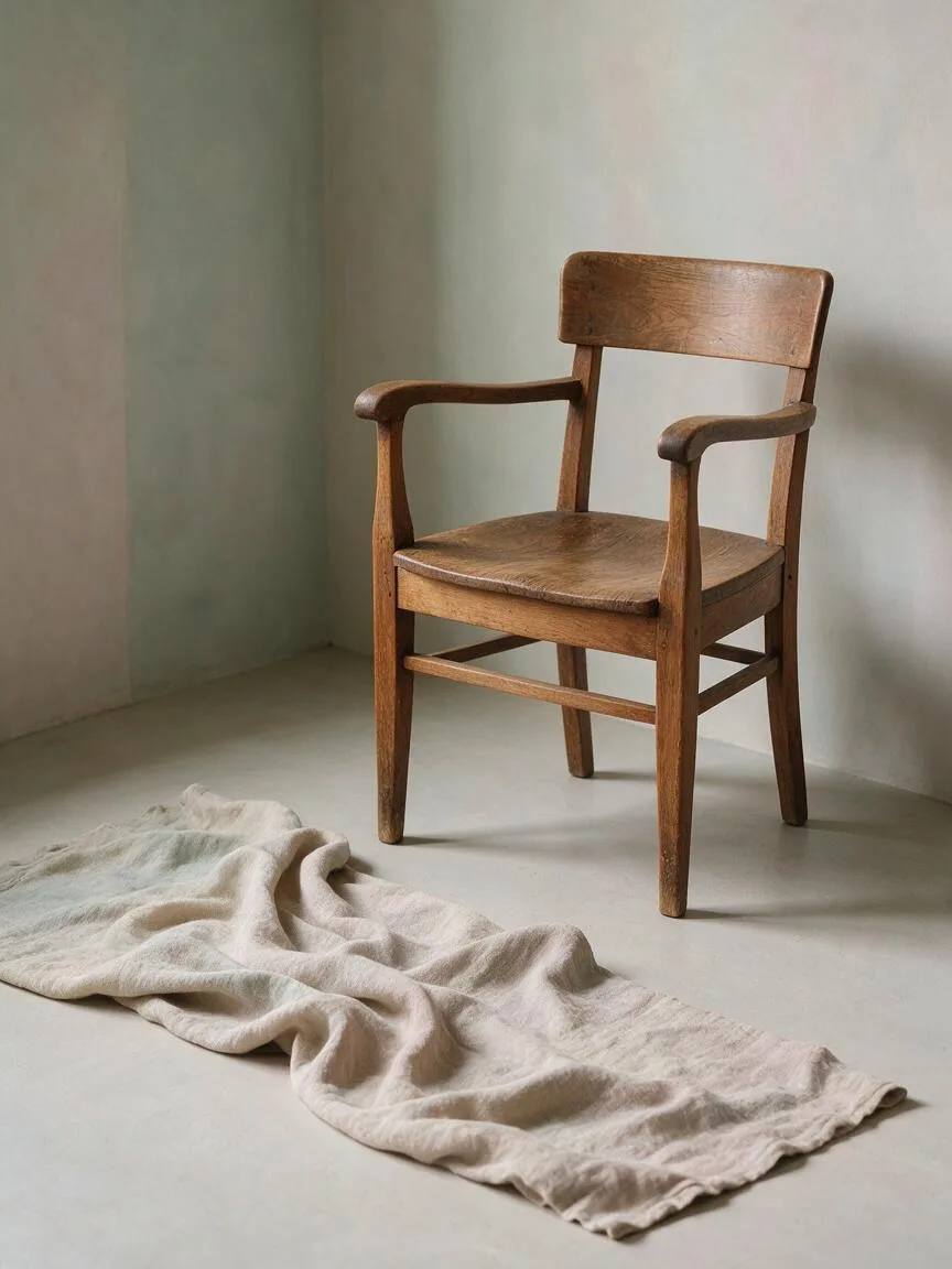
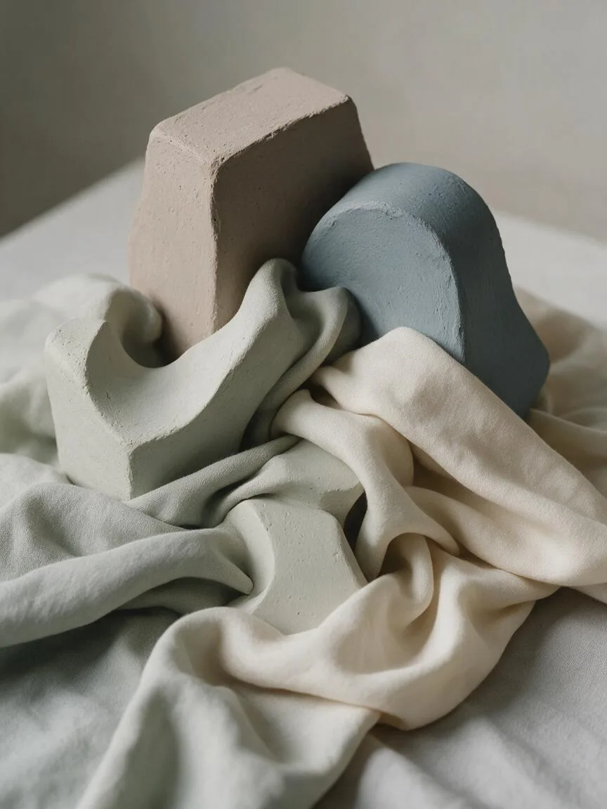
Prompt snippets
A still life of ceramic vases and dried flowers, Morandi color palette, muted tones, low saturation, grayish and pastel colors, soft diffused lighting, minimalist composition, elegant and serene atmosphere, 8k, photorealistic --ar 16:9 --style rawA girl wearing a Morandi-toned sweater sitting by a window, low saturation, grayish tones, combination of dusty pink and sage green, soft natural light, tranquil and elegant atmosphere, cinematic, minimalist compositionA slow pan across a minimalist interior room painted in Morandi colors, muted beige, dusty pink, and sage green walls, soft natural window light, serene and calm mood, high quality, cinematic
What it is
Morandi Colors originate from the still life paintings of Italian artist Giorgio Morandi. It refers to a color system that reduces saturation and incorporates grayish tones. It is not simply black, white, and gray; instead, it overlays all colors with a grayish layer, resulting in a soft and restrained visual character.
Visual and emotional effect
This color system reduces the aggressiveness of colors, evoking a calm, elegant, restrained, and premium emotional response. The imagery is not glaring; it has a gentle, breathing rhythm, often used to create an artistic, vintage, or minimalist atmosphere.
When to use it
It is suitable for scenes that require conveying introspection, calmness, or a premium texture. Examples include still life photography, minimalist interior design, artistic portraits, flat illustration, and UI backgrounds that need to reduce visual noise. When a frame contains many elements, Morandi colors can effectively unify the color palette and prevent clutter.
Prompt tips
Use core keywords such as Morandi color palette, muted tones, low saturation, or grayish colors. Morandi colors rely heavily on lighting to convey texture. Be sure to pair them in your prompt with soft diffused lighting or overcast lighting. Avoid strong, direct light that creates hard shadows, as it will destroy the soft feel of the gray tones.
Common mistakes
The most common mistake is equating Morandi colors with “pure gray” or simply applying a gray filter over the image. True Morandi colors retain hue tendencies—such as red, yellow, blue, and green—but with reduced purity. Adding only grayness will make the image look muddy and lifeless. Retaining subtle color tendencies is what gives Morandi colors their premium and warm feel.