Analogous Colors
Analogous Colors Analogous Color Scheme
Color & GradingA color scheme that selects 2 to 5 adjacent colors on the color wheel, creating a highly harmonious, unified, and visually non-conflicting tonal foundation.
Also known as: Analogous Color Scheme
- Midjourney
- Kling
- Cursor
Prompt snippets
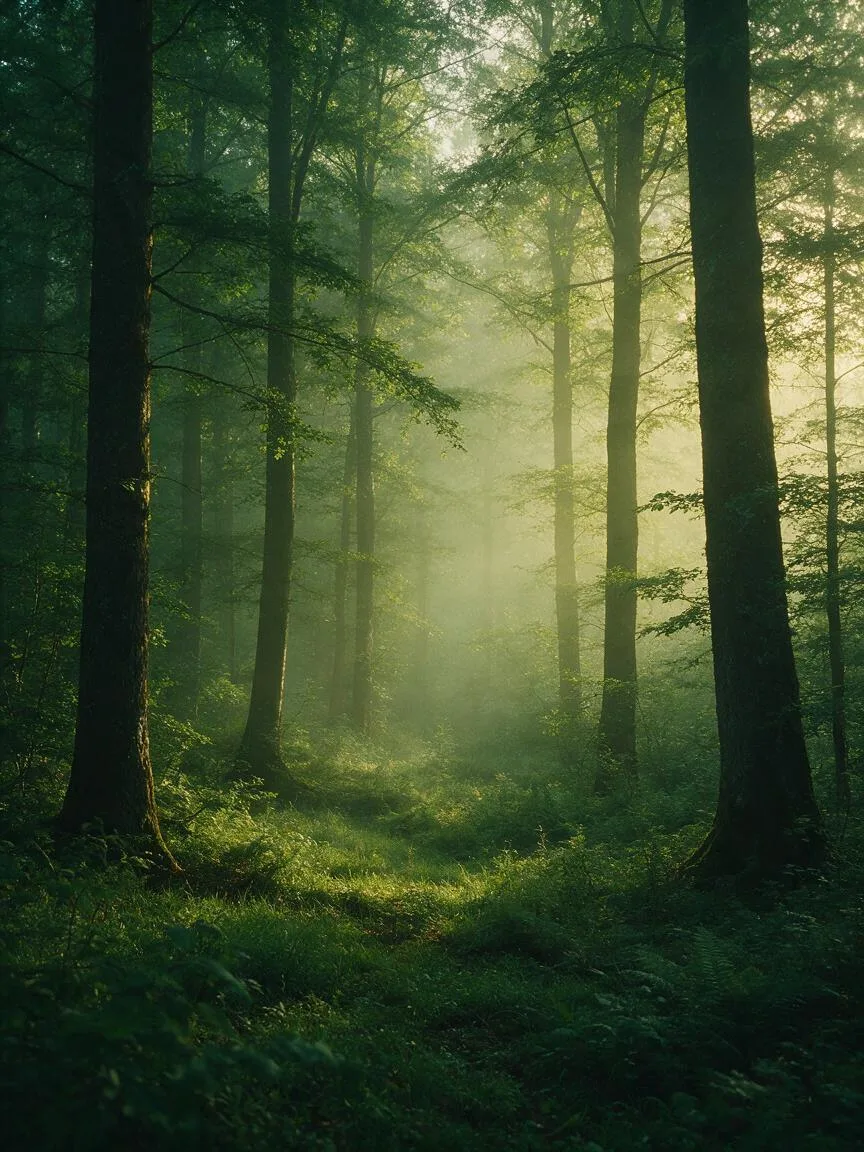
A serene landscape of a misty forest at dawn, analogous color scheme of deep greens and soft yellow-greens, harmonious color palette, cinematic lighting, photorealistic --ar 16:9 --v 6.0A serene morning forest landscape, using an analogous color scheme of deep greens and soft yellow-greens, harmonious and unified colors, cinematic lighting, photorealistic style, high quality.Please generate CSS styles for this card component using an analogous color scheme (e.g., #2B5B84, #4385A6, #62A8C2), ensuring a harmonious transition for background, border, and text colors without strong contrast conflicts.
What it is
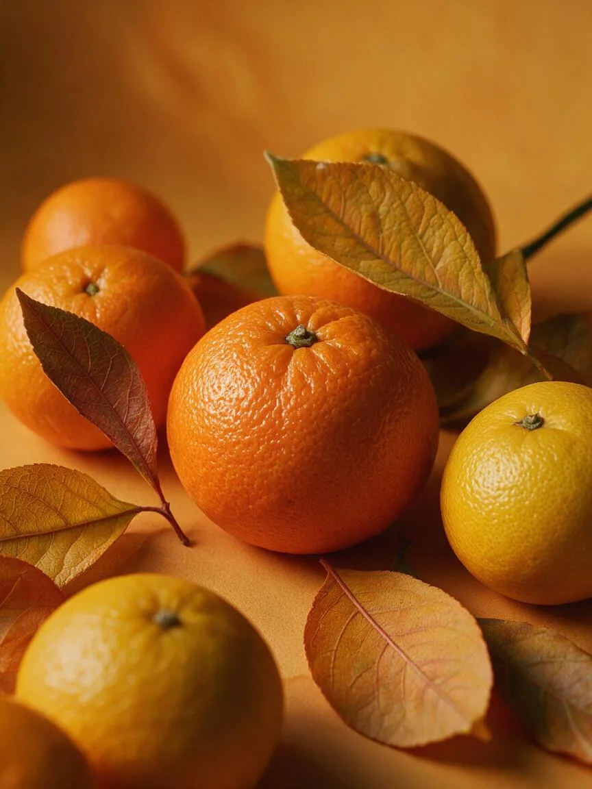
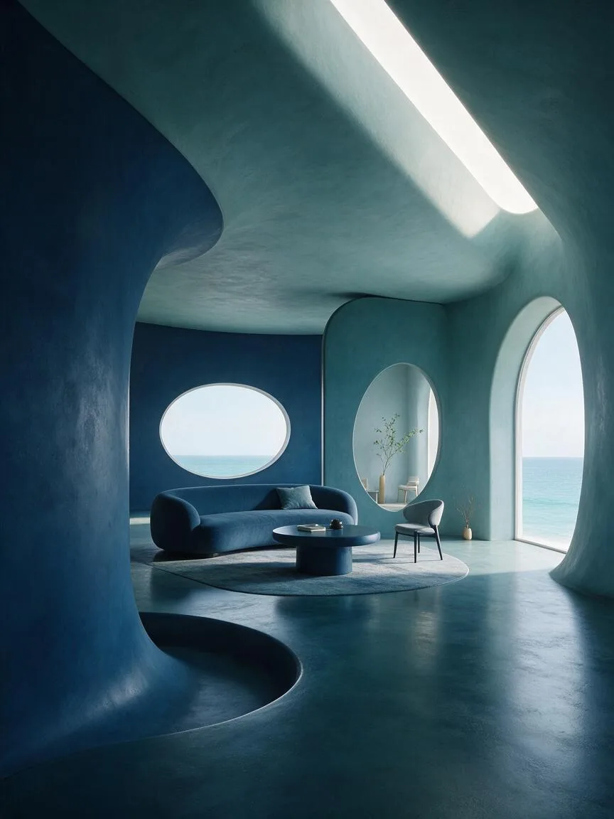
Analogous Colors refer to 2 to 5 colors that are adjacent to each other on the color wheel. They typically consist of one dominant color (covering the largest area) and one or two supporting colors. For example, blue, blue-green, and green, or red, red-orange, and orange, are classic analogous combinations.
Visual and emotional effect
This color scheme is visually highly harmonious and comfortable, eliminating any sense of conflict between colors. Emotionally, it tends to convey a calm, natural, unified, or immersive atmosphere. Because it lacks drastic hue contrast, the image can easily appear flat; therefore, it usually relies on variations in value (lightness/darkness) and saturation (vividness) to build spatial depth and visual focus.
When to use it
Suitable for scenes that require creating a specific environmental atmosphere or emotional tone, such as expressing the warm tones of autumn (red, orange, yellow), the tranquility of the ocean (blue, blue-green), or localized neon transitions in cyberpunk. In UI design, it is often used for soft background gradients or component state indicators; in film and photography, it is used to express a sense of environmental inclusiveness or a character’s inner peace.
Prompt tips
Do not just write “analogous colors,” as this will cause the AI to randomly diverge in hue. Instead, directly specify a concrete color combination, such as “analogous color palette of teal and cyan.” Combining this with “harmonious” or “low contrast” can further reinforce the unity of the image.
Common mistakes
Mistaking analogous colors for Monochromatic. Monochromatic refers to different values and saturations of a single hue, whereas analogous colors span across different hues (even though they are very close). Another mistake is allowing the image to lack contrast entirely; when using analogous colors, you must introduce black, white, gray, or strong light and shadow contrast to break the monotony.