Low Saturation
Low Saturation Desaturated Low Chroma Muted Colors
Color & GradingA color grading technique that reduces color purity and visual stimulation, shifting colors toward gray to create a restrained, sophisticated, or nostalgic mood.
Also known as: Desaturated · Low Chroma · Muted Colors
- Midjourney
- Sora
- Kling
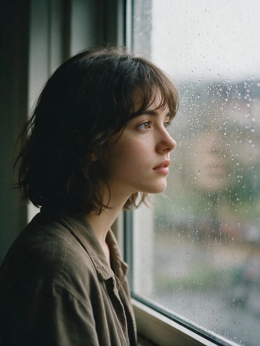
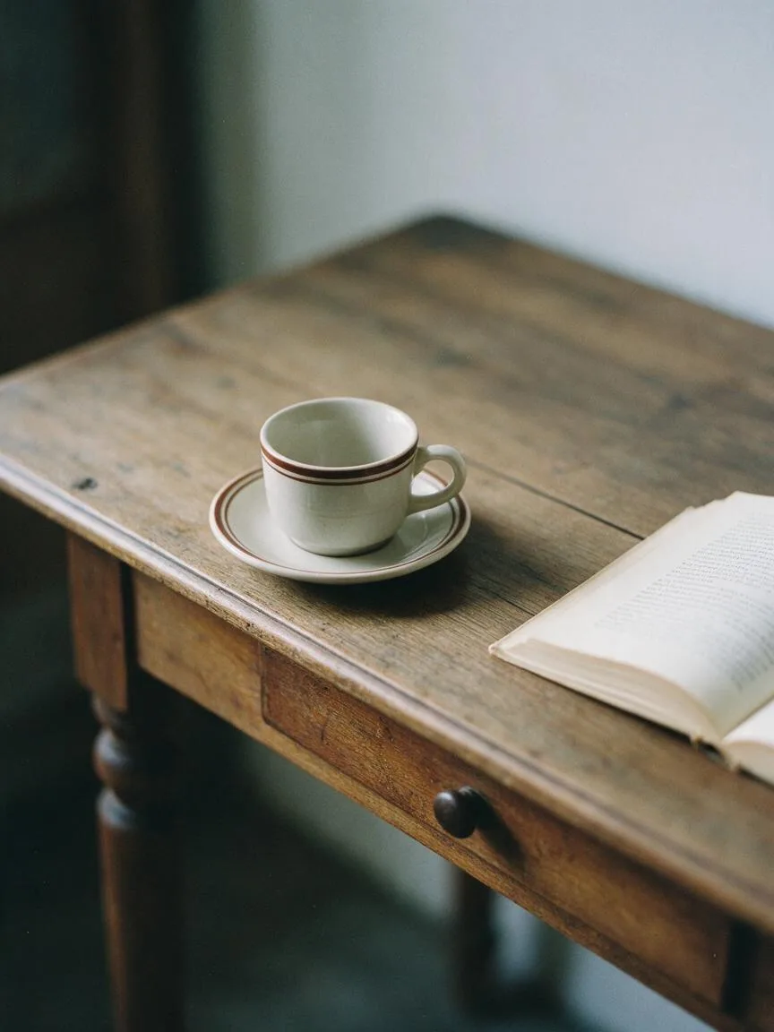
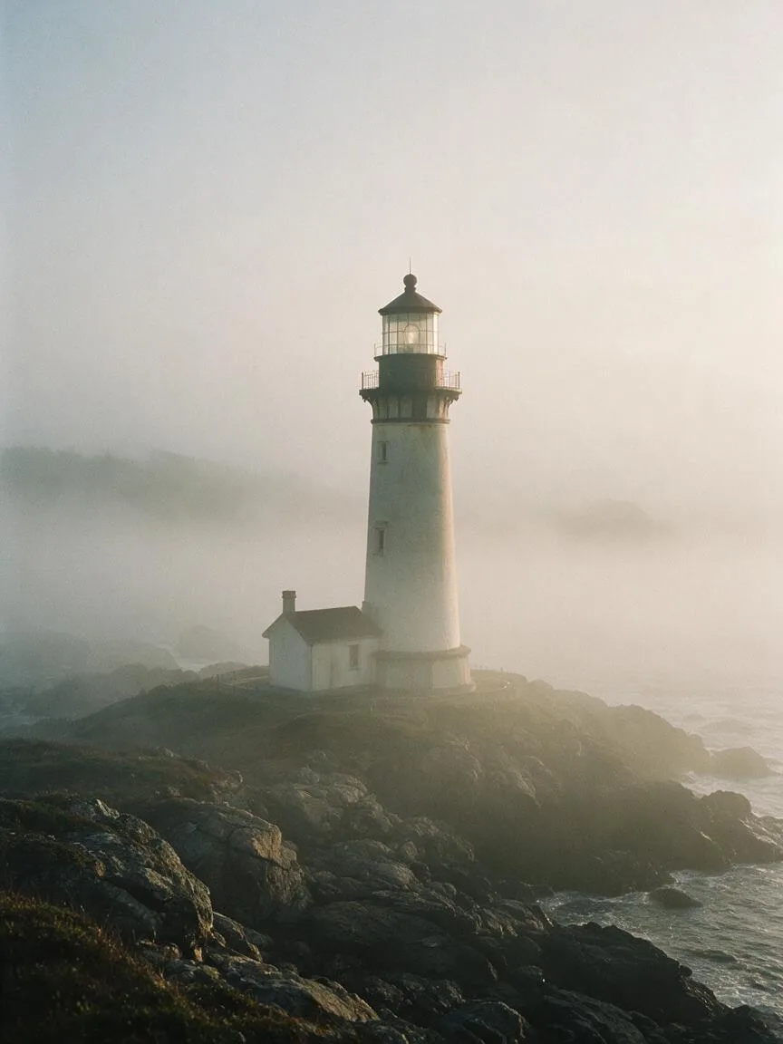
Prompt snippets
A cinematic portrait of a young woman looking out a rainy window, muted colors, desaturated tones, soft diffused lighting, 35mm film photography --ar 16:9 --style rawA slow tracking shot through a misty pine forest, desaturated color palette, low saturation, moody and quiet atmosphere, cinematic lighting, 4k.A woman in a trench coat walking down a street at dusk, low color saturation, dark and soft tones, cinematic texture, melancholic atmosphere, high-contrast lighting.
What it is
Low Saturation refers to reducing color purity, shifting the colors in an image toward gray. By diminishing the visual impact of colors, it gives the image a restrained, soft, and visually quiet texture.
Visual and emotional effect
Desaturated images effectively reduce visual fatigue, shifting the viewer’s attention from vibrant colors to lighting, texture, composition, and character emotion. It is often used to convey tranquility, melancholy, nostalgia, sophistication, or coolness, naturally carrying a detached cinematic feel.
When to use it
Suitable for moody portraits, documentary photography, vintage and nostalgic themes, and minimalist design. It is also ideal when the image contains complex elements and color distraction needs to be reduced to highlight the subject’s silhouette and lighting layers.
Prompt tips
- Degree and texture control: Using
desaturatedallows the image to fade in color more naturally; usingmuted colorsreduces saturation while retaining some color tint and warmth. - Environmental support: Low saturation requires reasonable lighting support. Pairing it with
overcast,foggy, orsoft diffused lightingmakes the desaturated effect more physically logical. - Maintain clarity: Simply reducing saturation can make the image look gray and flat. It is recommended to add
cinematic contrastorclear detailsto maintain image clarity and luminosity.
Common mistakes
- Equating “low saturation” with “black and white” or “monochromatic”: Low saturation still retains multiple hues, just with low purity; whereas monochromatic or grayscale strips away hue entirely.
- Gray and muddy images: If you only prompt for low saturation without controlling lighting, the AI is likely to generate a “muddy” image lacking contrast. You must use lighting and contrast prompts to ground the image.