Complementary Colors
Complementary Colors Contrast Colors
Color & GradingA combination of two colors positioned 180 degrees apart on the color wheel, using extreme color contrast to strengthen visual focus and image tension.
Also known as: Contrast Colors
- Midjourney
- Runway
- Kling
- Cursor

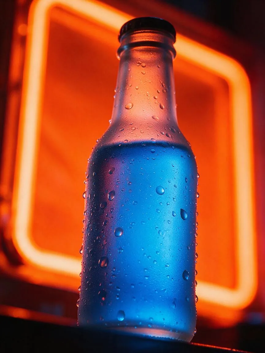
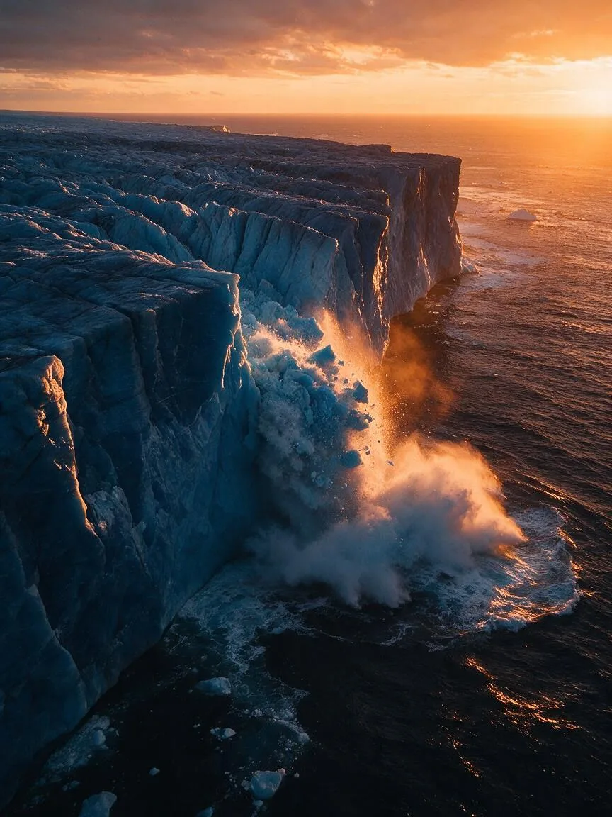
Prompt snippets
A portrait of a cyberpunk hacker, wearing a neon blue jacket, standing in a dark room illuminated by warm orange holographic screens, complementary colors, blue and orange color palette, cinematic lighting, highly detailed --ar 16:9 --style rawA vibrant flat illustration of a futuristic cityscape, using a strict red and green complementary color palette, high contrast, bold geometric shapes, smooth panning camera movement.A woman wearing a vintage red dress walking down a rainy street lit by cyan-green neon lights, complementary color scheme, cinematic color grading, strong visual contrast, high definition, slow motion shot.Implement a button hover animation using GSAP and CSS variables. The default state has a deep blue background with warm orange text; on hover, the background transitions to warm orange and the text to deep blue. Use a cubic-bezier easing function and add a slight text scale effect to ensure visual impact during the complementary color transition.
What it is
Complementary Colors refer to two colors positioned exactly opposite each other (180 degrees apart) on the standard color wheel. The three most classic pairs are red and green, blue and orange, and yellow and purple. In AI image and video generation, this is a fundamental color theory control method used to establish the strongest color contrast in a 2D frame.
Visual and emotional effect
Complementary colors create maximum visual vibration and clarity. When placed side by side, they intensify each other’s saturation, giving the image strong visual impact and vitality. The red-green contrast often brings a sense of drama, festivity, or the conflict between nature and the artificial; the blue-orange contrast (the basis of the Teal and Orange look) is widely used for cinematic, interwoven warm and cool emotional expressions; the yellow-purple contrast tends to evoke mystery, luxury, or a surreal atmosphere.
When to use it
- When you need to immediately grab the viewer’s attention and highlight the main subject (e.g., a bright subject against a dark background).
- When creating visual styles like Pop Art, Memphis Design, or Cyberpunk that require high saturation and strong contrast.
- During video transitions or shot changes, using complementary color jump cuts to create visual stimulation.
Prompt tips
In tools like Midjourney, explicitly specifying the exact complementary color pair (e.g., red and green color palette) is more controllable than simply writing complementary colors. To reduce harshness, add terms like desaturated or pastel, or adjust lighting (e.g., dim lighting) to soften the contrast. In video tools, combine with color grading to emphasize specific color tones.
Common mistakes
- Equal Area Ratio: Using a 1:1 area ratio for complementary colors causes the image to lose focus and creates visual dizziness. The correct approach is to establish a dominant color (occupying 70%-80%) and use the complementary color as an accent (occupying 20%-30%).
- Ignoring Value and Saturation: If both colors have identical value and saturation, a “vibrating” effect occurs at the boundaries. You should create differences in lightness or purity between the two, such as pairing dark red with light green.