Warm Colors
Warm Colors Warm Color Warm Tone Warm Color Palette
Color & GradingA color tendency dominated by reds, oranges, yellows, and their derivatives, used to evoke warmth, vitality, or nostalgia.
Also known as: Warm Color · Warm Tone · Warm Color Palette
- Midjourney
- Sora
- Runway
- Kling
- Dreamina
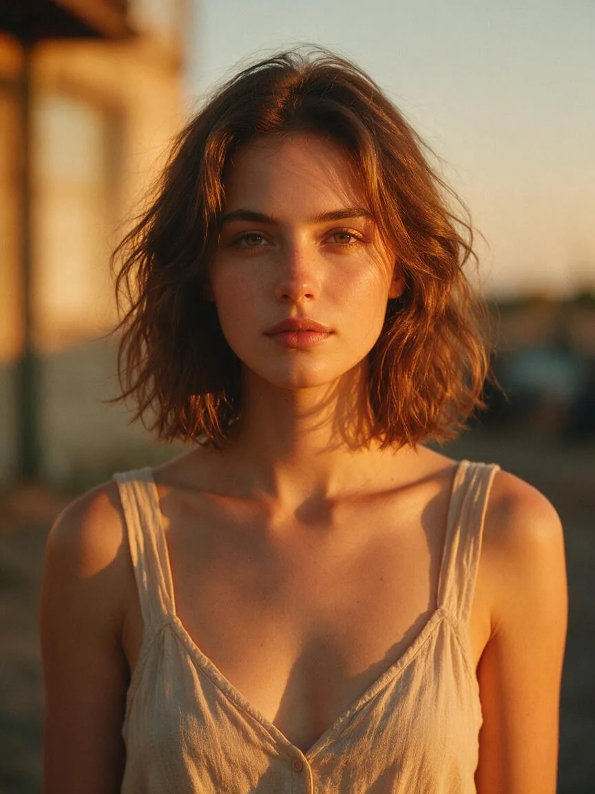
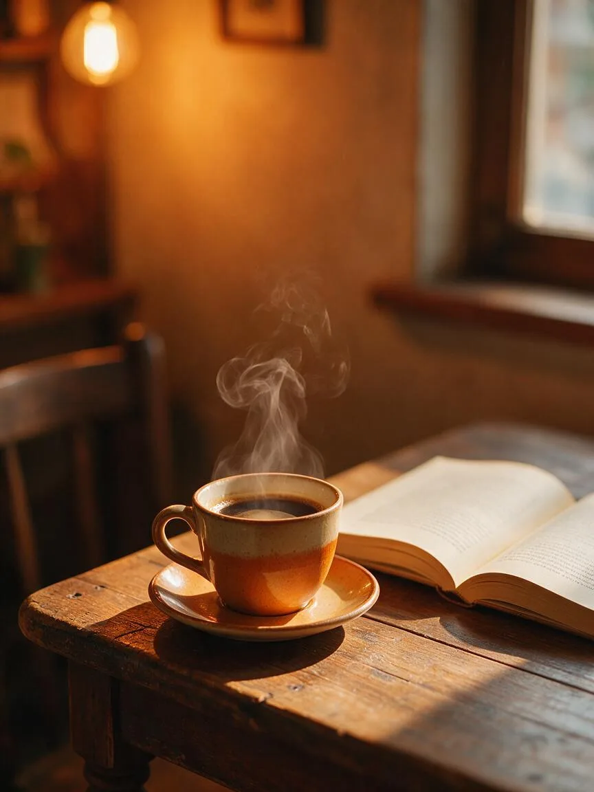
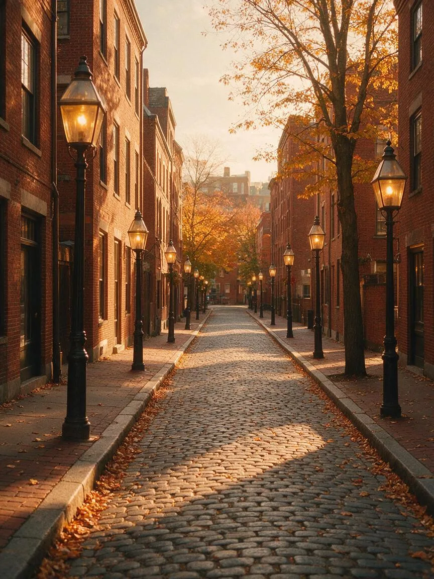
Prompt snippets
portrait of a young woman bathed in warm sunlight, golden hour lighting, warm color palette, amber and soft orange hues, cozy atmosphere, cinematic lighting --ar 16:9 --style rawA cinematic shot of a cozy cabin interior during sunset, warm color grading, rich amber and golden tones, soft volumetric light coming through the window, nostalgic and inviting mood.Cinematic shot of a vintage café interior at sunset, warm color grading, rich amber and golden tones, soft volumetric light streaming through the window onto a wooden table, nostalgic and cozy atmosphere, high quality.Autumn forest, warm color palette, golden and orange-red leaves interwoven, sunlight piercing through the canopy creating a Tyndall effect, full of warmth and vitality, 8k resolution, highly visually striking.
What it is
Warm colors refer to a color palette dominated by reds, oranges, yellows, and their derivatives on the color wheel. It is not a single color, but a range of hues used to define the overall color atmosphere of an image.
Visual and emotional effect
Visually, warm colors have an advancing and expanding effect that brings the subject closer to the viewer. Emotionally, they typically convey warmth, passion, nostalgia, coziness, and comfort. However, if used improperly or with excessively High Saturation, they can easily induce feelings of restlessness, stuffiness, or visual heaviness.
When to use it
Ideal for portraying cozy family scenes, vintage or nostalgic atmospheres, autumn landscapes, portraits during the Golden Hour, food photography that stimulates appetite, and dynamic commercial sports scenes.
Prompt tips
Avoid relying solely on broad terms like “warm colors”; instead, specify hues such as amber, terracotta, or golden. Combining these colors with specific lighting (e.g., candlelight, sunset) and materials (e.g., wood, leather, brass) significantly enhances the tactile quality of the warm tones. Additionally, retaining a touch of cool colors in the shadows prevents the image from becoming visually muddy.
Common mistakes
The biggest misconception is assuming that warm tones simply mean increasing High Saturation or applying a red filter. True control over warm colors lies in shifting the hue, not just piling on purity. Furthermore, ignoring the contrast provided by cool environmental colors leads to a lack of depth; warm colors without contrast will appear flat and glaring.