Cool Colors
Cool Colors Cold Tone Cool Tone
Color & GradingA color tendency dominated by shorter-wavelength colors such as blue, green, and purple, conveying calmness, technology, melancholy, or mystery.
Also known as: Cold Tone · Cool Tone
- Midjourney
- Sora
- Kling
- Runway
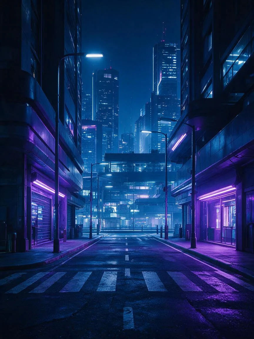
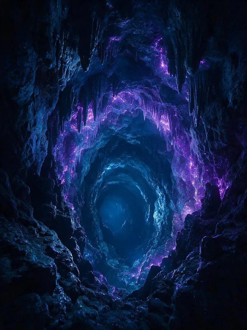

Prompt snippets
A futuristic cyberpunk city street at night, dominated by cool colors, deep blue and neon purple lighting, cinematic lighting, high contrast, 8k resolution, photorealistic --ar 16:9 --style rawA cinematic shot of a lone astronaut walking on a frozen alien planet, cool color palette, icy blue and teal tones, soft diffused light reflecting off the frost, highly detailed, realistic texture.A serene deep-sea diving scene dominated by cool colors, featuring dark blue seawater and bioluminescent cyan creatures, cinematic lighting, delicate caustic effects, creating a mysterious and oppressive atmosphere.A moody portrait of a woman in a dimly lit room, cool color grading, shadows tinted with deep cyan and cool gray, shot on 35mm lens, subtle camera pan.
What it is
In the color wheel, cool colors refer to color tendencies composed of shorter-wavelength colors such as blue, green, and purple. Physically and visually, they have a shrinking and receding effect; psychologically, they evoke calmness, rationality, or detachment.
Visual and emotional effect
Visually, cool colors can increase the spatial depth of an image, making the background appear more distant. Emotionally, they are often used to convey technology, the future, calmness, and professionalism, or melancholy, loneliness, coldness, mystery, and oppression. They are the cornerstone for building the underlying atmosphere of an image.
When to use it
Suitable for sci-fi and Cyberpunk scenes, thriller and suspense genres, and natural cold environments like ice and snow or the deep sea. Additionally, when a strong contrast with warm colors is needed (such as teal in Teal and Orange) to highlight the visual center, cool colors are the optimal choice for backgrounds or shadows.
Prompt tips
- Specify concrete colors: Avoid just writing “cool colors”. Use “cyan and deep blue tones” or “teal and purple lighting” for greater precision.
- Combine with materials: Cool colors have stronger expressiveness on reflective materials like metal, ice, water, and glass. Adding material descriptions to your prompt can enhance texture.
- Specify post-production styles: Use terms like “cool color grading” or “shadows tinted with cool cyan” to directly intervene in color grading.
Common mistakes
- Assuming cool colors mean a grayed-out image. High-saturation neon blue or cyan-green are still standard cool colors; low saturation is merely one of their variations.
- Overusing cool colors across the entire frame, leading to visual fatigue. Usually, a small amount of warm color (such as human skin tone or a faint firelight) needs to be introduced as a contrasting accent—like “a touch of red amidst a sea of green”—to break the monotony and guide the visual focus.