Limited Color Palette
Limited Color Palette Restricted Color Palette Restricted Palette Limited Palette Constrained Color Palette
Color & GradingA color control technique that strictly limits the types and range of colors in an image to enforce a unified overall tone and eliminate stray colors.
Also known as: Restricted Color Palette · Restricted Palette · Limited Palette · Constrained Color Palette
- Midjourney
- Sora
- Kling
- Runway
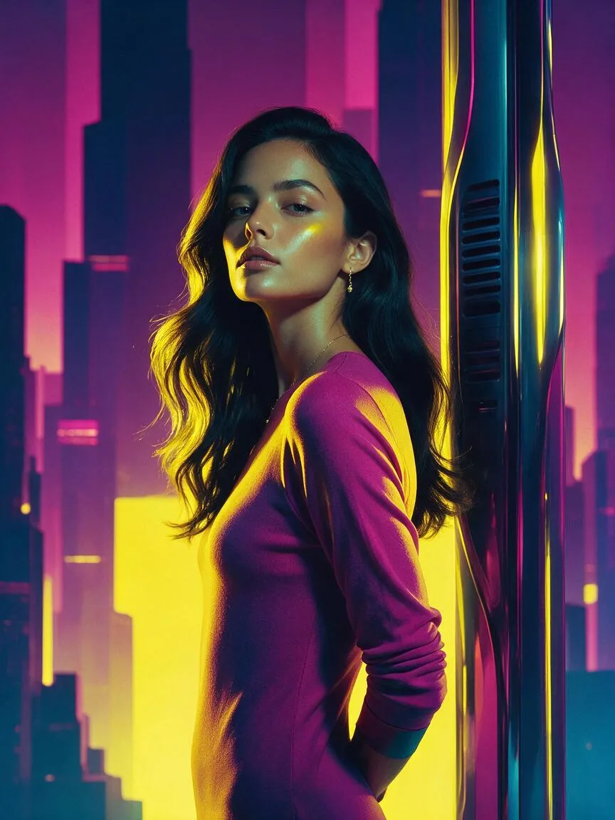
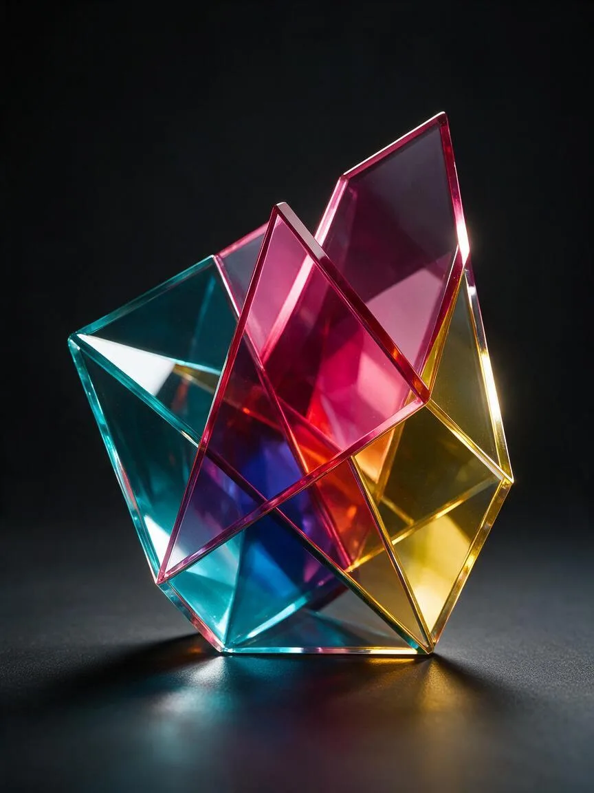
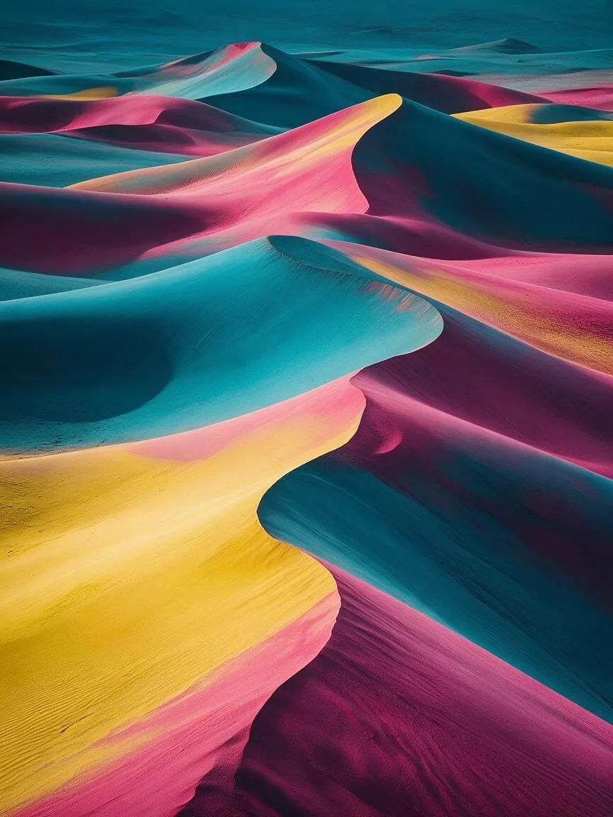
Prompt snippets
A portrait of a woman in a futuristic city, restricted color palette of cyan, magenta, and yellow, minimalist background, high contrast, cinematic lighting --ar 16:9 --style raw --v 6.0A cinematic tracking shot of a lone astronaut walking through a monolithic structure, limited color palette of stark black, white, and muted gold, highly detailed, photorealistic.A mechanical butterfly resting on a glowing blue flower, limited color palette of deep ocean blue and silver white, blurred background, macro photography, extreme detail.A slow pan across a desert landscape at dusk, restricted color palette of burnt orange, deep purple, and dark teal, cinematic, 4k.
What it is
A Limited Color Palette is a strict color control strategy that restricts an image to only a few pre-specified colors, typically two to five. By filtering out the rich colors of the natural world, it forces the image to converge within specific hue, brightness, or saturation ranges, achieving high visual unity.
Visual and emotional effect
- Visual focus: Removes redundant color distractions, guiding the viewer’s eye to the subject’s form, lighting, and composition.
- Stylization and graphic design feel: Gives realistic footage the texture of illustrations, posters, or vintage prints, enhancing the design attributes of the image.
- Emotional anchoring: Reinforces specific emotions through extreme color restrictions. For example, black and white paired with a single bright color (like the red coat in Schindler’s List) creates a strong visual impact, while a low-saturation limited palette conveys a cold or melancholic atmosphere.
When to use it
- When creating works with a strong graphic design feel, Pop Art, or vintage poster style.
- When image elements are too cluttered and you want to simplify the scene using color to highlight the subject.
- In video generation, when you need to maintain absolute color consistency across multiple shots or a long take, avoiding color drift caused by AI random generation.
Prompt tips
- Specify colors explicitly: Do not just write “limited color palette”; it must be immediately followed by the specific color combination, such as
restricted color palette of teal, orange, and muted yellow. - Combine with color modes: Introduce printing or display color concepts like CMYK or RGB, such as
CMYK color palette, to enhance a vintage or specific industrial texture. - Pair with style keywords: Combining with
flat colororcel shadingcan further lock in color transitions and prevent the AI from improvising.
Common mistakes
- Writing only “limited color palette” without specifying colors: The AI cannot intuitively understand what colors you want to restrict and will end up using its default highly saturated colors.
- Conflicting with complex lighting: If you simultaneously request highly complex environmental light reflections (e.g., neon reflections on water), the limited color palette may conflict with physical lighting logic, resulting in unnatural color blocks in the image.