Split-Complementary Colors
Split-Complementary Colors Split-Complementary Color Scheme Split-Complementary Palette
Color & GradingA color scheme consisting of a base color and the two colors adjacent to its complement, combining high contrast with visual harmony.
Also known as: Split-Complementary Color Scheme · Split-Complementary Palette
- Midjourney
- Kling
- Runway
- Claude
- Cursor
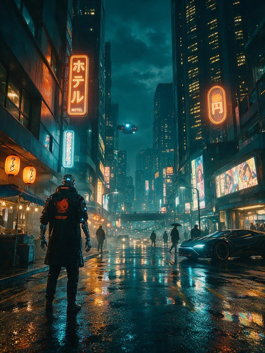


Prompt snippets
/imagine prompt: a cyberpunk city street at night, split-complementary color scheme, deep teal base with vibrant orange and warm yellow accents, cinematic lighting, high contrast --ar 16:9 --v 6.0A visually striking cyberpunk-style illustration using a split-complementary color scheme, with deep teal as the main color, accented with bright orange and warm yellow, high contrast, cinematic lighting, rich in details.A slow tracking shot through a neon-lit futuristic market, split-complementary color palette of deep blue, bright orange, and golden yellow, cinematic color grading, high contrast.Please generate a CSS variable color scheme based on split-complementary colors. Use deep blue (#003366) as the base color. Calculate and extract the two colors adjacent to its complement (e.g., orange and yellow tones) as accent colors, and output the corresponding CSS code.
What it is
Split-Complementary Colors is a color scheme based on the color wheel. It selects a base color and uses the two colors adjacent to its complement (the color 180° opposite). For example, if the base color is blue, its direct complement is orange, making the split-complementary colors yellow-orange and red-orange.
Visual and emotional effect
This scheme retains the high contrast and visual tension of complementary colors, but by avoiding the exact opposite on the color wheel, the conflict is significantly reduced. The colors are rich and well-layered, offering strong visual appeal without being glaring or causing visual fatigue like pure complementary colors. The overall mood is vibrant yet harmonious.
When to use it
Ideal for designs that need to highlight a subject (using the base color) while using two accent colors to enrich the visual layers. Widely used in illustration, UI design, photo post-processing, and brand visual identity systems. It is particularly suited for projects that require visual impact while maintaining a premium and balanced look.
Prompt tips
AI has limited understanding of abstract color theory, so do not just input “split-complementary”. Specify the exact color combinations, such as “teal base with vibrant orange and warm yellow accents”. Additionally, apply the 60-30-10 color proportion rule by clearly defining the area ratio of the main color to the accent colors in the prompt, ensuring a stable color structure.
Common mistakes
The most common mistake is giving the three colors equal area in the image. This causes the image to lose its visual focal point and appear cluttered. The correct approach is to strictly follow a dominant-subordinate relationship, letting the base color dominate (usually over 60%), while the other two split colors serve only as accents and highlights.