High Saturation
High Saturation Vivid Colors Vibrant Colors
Color & GradingA visual characteristic defined by high color purity and minimal gray components, using vivid and intense colors to enhance the visual impact of an image.
Also known as: Vivid Colors · Vibrant Colors
- Midjourney
- Sora
- Kling
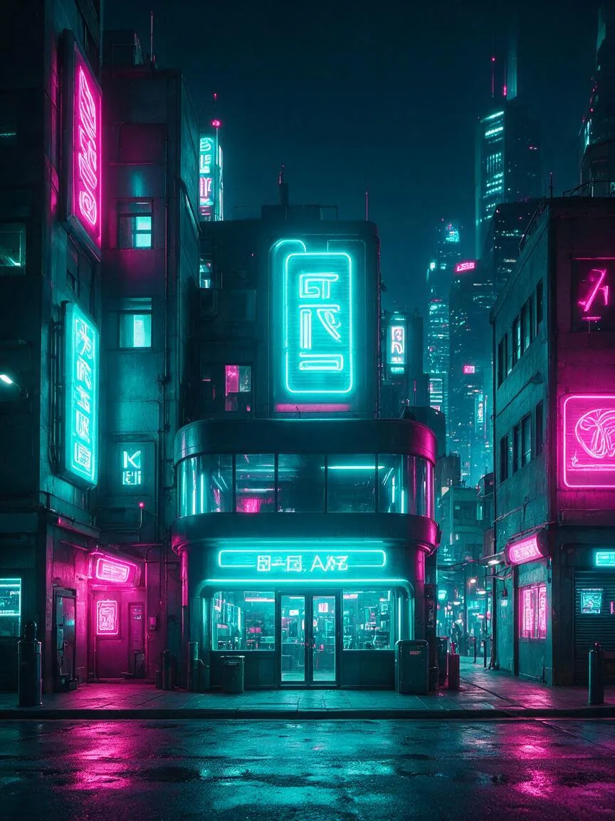
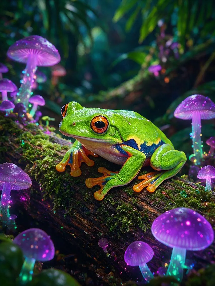
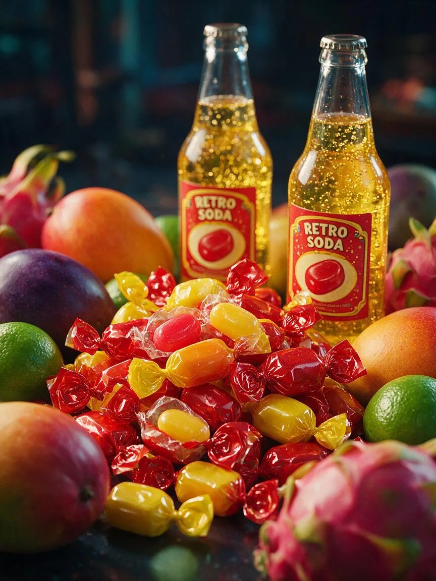
Prompt snippets
A futuristic cyberpunk city street at night, neon lights, highly saturated colors, vibrant cyan and magenta, vivid glowing signs, cinematic lighting, 8k, photorealistic --ar 16:9A vibrant tropical forest with exotic flowers, highly saturated greens and bright reds, vivid sunlight filtering through the canopy, ultra-realistic, 4k.A vibrant pop art style portrait of a girl, highly saturated colors, bright yellow and hot pink, strong light and shadow contrast, flat design, minimalist background.
What it is
High saturation refers to a visual characteristic defined by high color purity and minimal gray components. In the HSB color model, it represents an extremely high S (Saturation) value, rendering colors intensely vivid, pure, and vibrant, free from dull or murky impurities.
Visual and emotional effect
High saturation instantly captures the viewer’s attention, conveying moods of vitality, passion, fantasy, or extreme futurism. It is frequently used to create strong visual stimulation, evoking associations with neon lights, tropical rainforests, or pop art. However, if overused or applied poorly, it can lead to visual fatigue or result in a cheap, plastic-like appearance.
When to use it
It is well-suited for subjects requiring an emphasis on vitality, fairy-tale aesthetics, Cyberpunk, or surrealism. In commercial posters, game concept art, and music video visuals, high saturation effectively enhances visual impact. It is not recommended for scenes aiming to convey tranquility, realism, retro nostalgia, melancholy, or a sophisticated muted aesthetic.
Prompt tips
Use direct modifiers such as highly saturated, vivid colors, or vibrant colors. To prevent color distortion, combine these with specific lighting conditions (e.g., neon lighting, glowing) or distinct art styles (e.g., pop art, vaporwave). This gives the AI a clear context for how and where the intense colors should be applied.
Common mistakes
Assuming that simply adding highly saturated will yield a high-quality image. In reality, indiscriminately maxing out the saturation of all colors causes color bleeding and a loss of detail. The correct approach is to manage color contrast—for instance, highlighting specific highly saturated elements against a dark background, rather than making every color in the frame excessively vibrant without restraint.