Macaron Colors
Macaron Colors Macaron Color Scheme Pastel Colors Soft Tones Pastel Palette
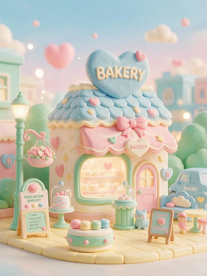
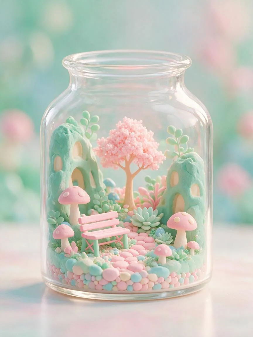
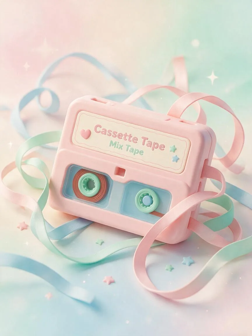
Color & GradingA soft color scheme with high brightness, low saturation, and a pastel texture. It creates a light and sweet visual atmosphere by reducing color purity and increasing brightness.
Also known as: Macaron Color Scheme · Pastel Colors · Soft Tones · Pastel Palette
- Midjourney
- Kling
- Runway
Prompt snippets
A cute 3D rendered bakery shop, macaron color palette, pastel pink, mint green, baby blue, soft lighting, dreamy atmosphere, clay render style, high brightness, low saturation --ar 16:9A dreamy girl's bedroom, macaron color palette, soft mint green, light pink, and pale yellow, high brightness and low saturation, soft diffused light, cozy and healing atmosphere, 3D rendered style, slow panning shot.A floating pastel colored balloon in a dreamy sky, macaron color palette, soft pink and light blue, gentle movement, slow motion, soft diffused lighting, cinematic.
What it is
Macaron Colors (also known as Pastel Colors) is a high-brightness, low-saturation pastel color scheme. Originating from the French dessert macarons, it is created by adding large amounts of white or pink to pure colors, reducing color purity and increasing brightness to form a soft, clear visual effect.
Visual and emotional effect
This color scheme significantly reduces the visual aggressiveness of an image, bringing feelings of lightness, healing, sweetness, and dreaminess. It diminishes the visual weight of the colors, making the image look as if it is covered with a soft filter. It is strongly associated with girlishness, childhood innocence, spring themes, or retro Y2K Aesthetic styles.
When to use it
Suitable for scenes that require a relaxed, cozy, and stress-free atmosphere. Examples include beauty and skincare visuals, children’s product packaging, spring-themed posters, dessert and catering promotions, as well as 3D rendering and illustration designs pursuing a dreamy, healing style.
Prompt tips
In AI image generation, in addition to directly using macaron color palette or pastel colors, it is recommended to layer in brightness and saturation control terms, such as high brightness, low saturation, high value. Additionally, pairing it with Soft Light or diffused light prevents the colors from looking glaring under strong light, maintaining the translucency of the pastels.
Common mistakes
It is most easily confused with Morandi Colors. Morandi Colors are medium-to-low brightness, low-saturation colors with a grayish tone, presenting a premium, cool, and restrained atmosphere; whereas Macaron Colors are high-brightness, low-saturation colors with a white tone, presenting a sweet, lively, and dreamy atmosphere. Furthermore, Macaron Colors are not neon colors; avoid using neon or vibrant prompts, as this will completely destroy their soft characteristics.