Duotone
Duotone
Image StylesA processing technique that replaces the dark and light areas of a photograph with two distinct colors, originating from the two-ink overprint printing technique. It regained popularity in brand and web visuals during the 2010s.
- Midjourney
- Stable Diffusion
- Flux
- Dreamina
Prompt snippets
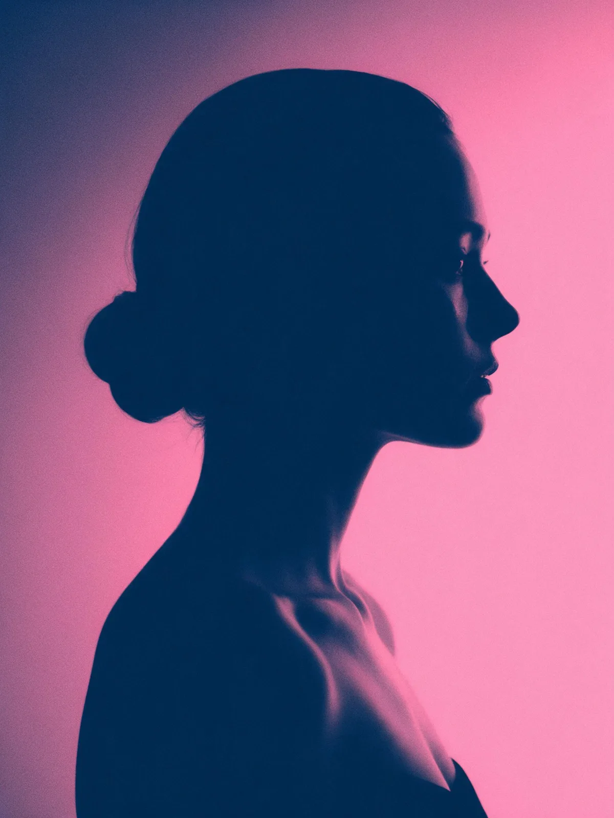
duotone photograph, two-color image, dark blue and pink, gradient map effect, bold contrast, halftone texture, portraitA head-and-shoulders portrait rendered as a duotone: every shadow is deep navy blue and every highlight is vivid pink, with fine grain and strong contrast, like a music festival poster.duotone portrait photograph, profile of a woman against a plain background, deep navy shadows and vivid pink highlights, only two colors, high contrast, fine film grain --ar 4:3 --style rawDuotone portrait photograph, profile of a woman against a plain background, deep navy shadows and vivid pink highlights, only two colors in the image, high contrast, subtle film grain
What it is
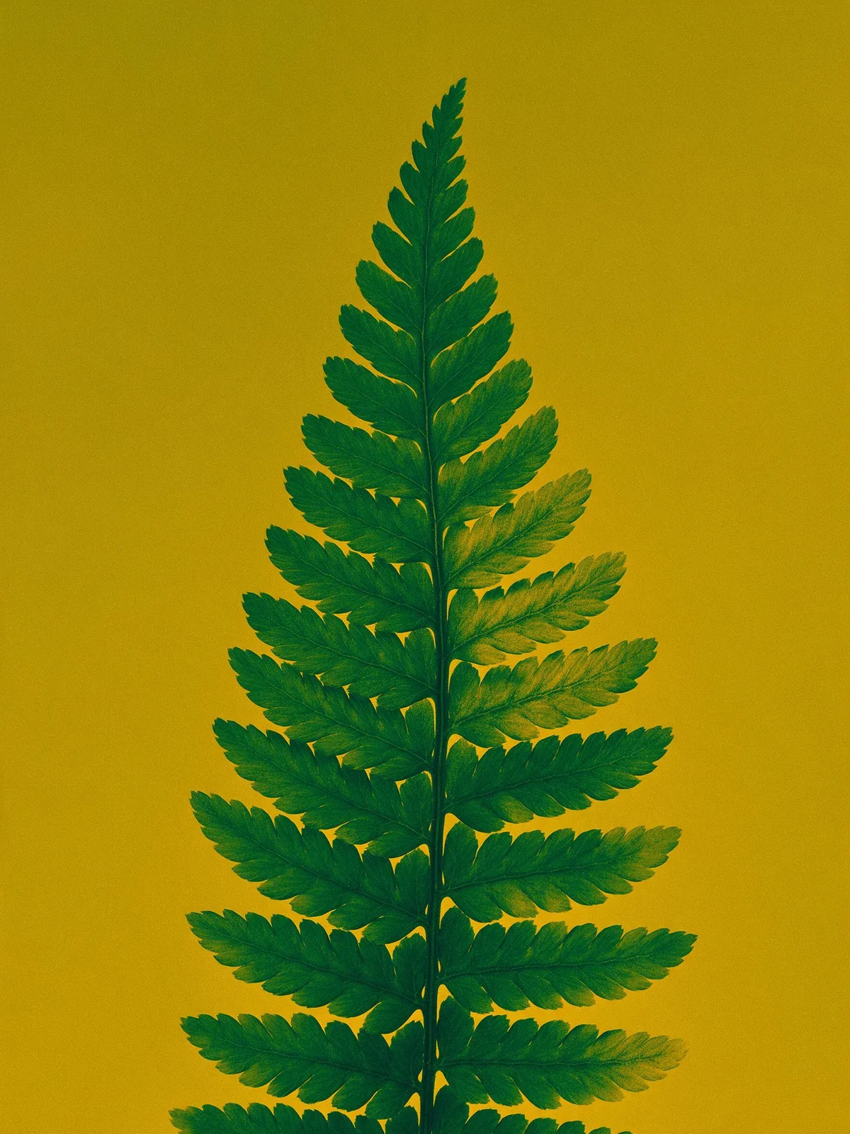
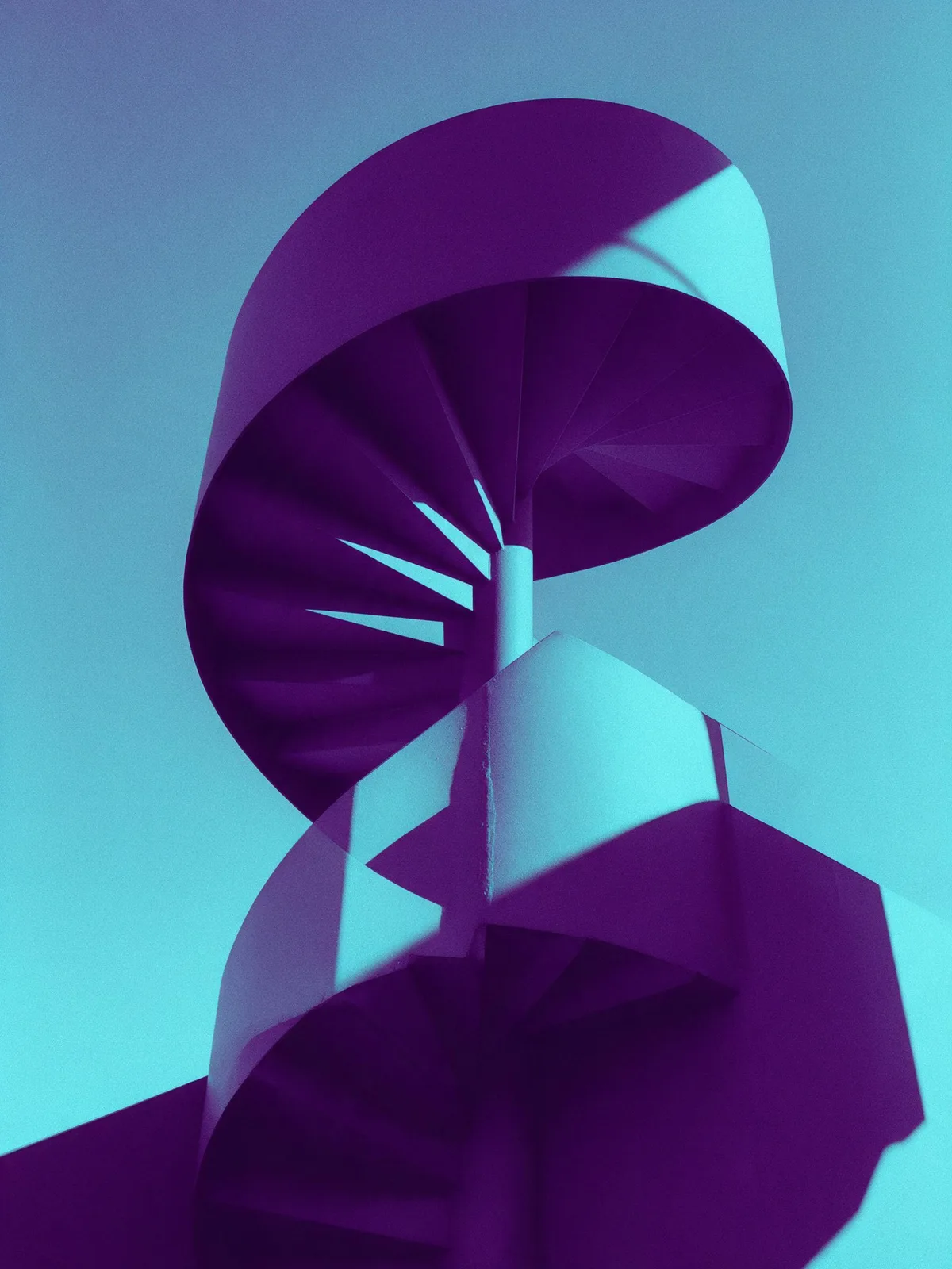
Duotone originated as a printing technique: two inks (typically black plus one spot color) were overprinted on the same grayscale photograph, giving the black-and-white image richer tones or a specific color cast. In digital design, duotone goes a step further: the photograph is first desaturated, then the darkest areas are mapped to one color and the brightest to another, with midtones transitioning between the two—essentially the gradient map effect in Photoshop. Around 2015, Spotify extensively used high-saturation duotone photos in its brand visuals, popularizing the style across websites, posters, and music festival graphics.
Visual and emotional effect
- Unified and bold: Photos from different sources instantly look like a cohesive series when wrapped in the same color pair.
- Graphic: The photorealistic feel is subdued, making the image look more like a poster.
- Mood is driven by the palette: Blue and pink feel trendy, black and gold feel premium, and orange and blue feel vibrant.
When to use it
- Unifying inconsistently styled portrait photos, such as for a speaker wall or a band lineup.
- Brand Key Visual, music, and event posters.
- When overlaying text on photos: the simplified color scheme makes text easier to read.
Prompt tips
- Basic combination:
duotone, two-color, [shadow color] shadows and [highlight color] highlights. Be as specific with the colors as possible. - Choose a dark color for shadows and a light or highly saturated color for highlights to ensure enough contrast.
- Add
film grainorhalftone textureto enhance the print aesthetic. - Models often introduce a third color. When strict color accuracy is required, a more reliable approach is to generate a standard photograph and then apply a gradient map in design software.
Common mistakes
- Misinterpreting duotone as “featuring objects of two colors.” It is a luminance-to-color mapping applied to the entire image, not merely replacing props with two specific colors.
- Choosing two colors with very similar luminance values, which causes the image to look muddy and lose contrast.
The sample images above are SVG approximations. For actual generated results, please refer to the specific model you are using.