Product Detail Page
Product Detail Page E-commerce Detail Page Detail Page Image
E-commerce VisualsA long-form visual asset in e-commerce product detail pages, composed of multiple vertically stacked images or a single extra-long image, used to comprehensively showcase product selling points, details, and usage scenarios.
Also known as: E-commerce Detail Page · Detail Page Image
- Midjourney
- Flux
- Dreamina
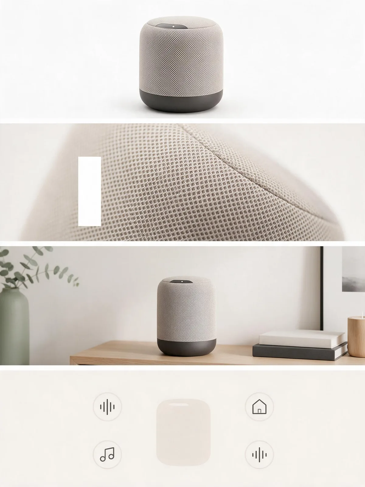
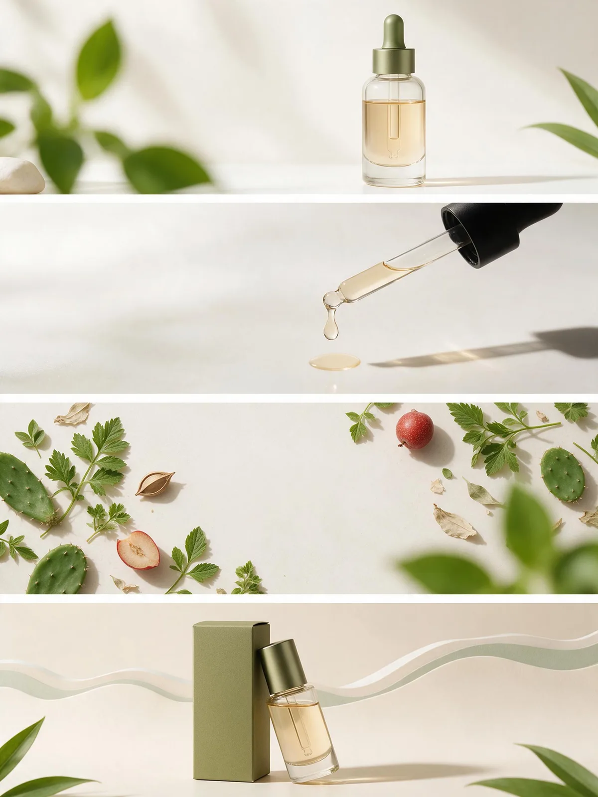
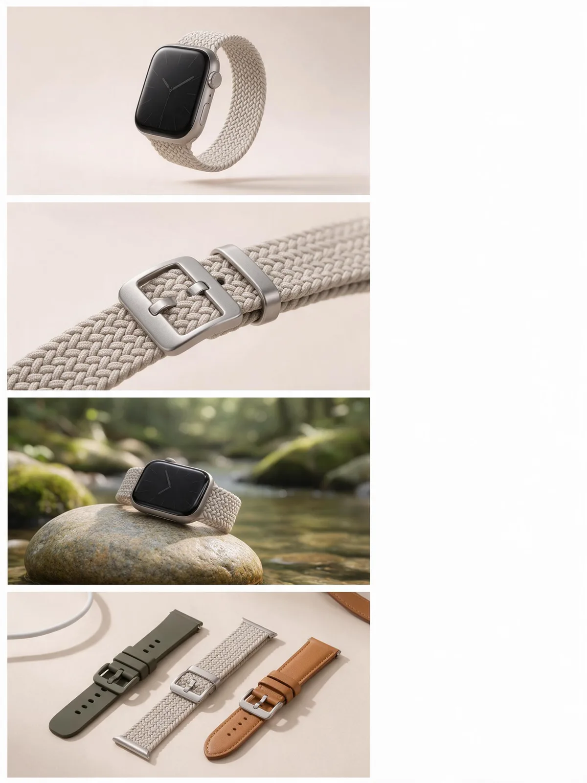
Prompt snippets
tall vertical e-commerce detail page layout for a smart speaker, four stacked panels: hero shot on white, close-up of the fabric mesh, speaker on a living room shelf, flat illustrated feature diagram, one restricted palette, bright even light, empty areas reserved for copy, no text, no letters --ar 9:16 --style rawA tall vertical e-commerce detail page for a smart speaker, made of four stacked panels: a hero shot on white, a close-up of the fabric mesh, the speaker on a living room shelf, and a flat illustrated feature diagram. One restricted palette and bright even light throughout, with empty areas left for copy but no text.Vertical long image for an e-commerce detail page, smart speaker, four panels from top to bottom: hero shot on white background, material close-up of the fabric mesh, lifestyle shot on a living room shelf, flat illustration style feature diagram, unified restricted color palette for the whole page, bright and even lighting, leave blank areas for copy in each panel, no text or letters anywhere in the image
How this look is built
Open in the builder ›An ad look is not one style word but the combination below. Opening it fills the matching slots; the subject is yours to write.
- CompositionNegative SpaceEach panel needs space for selling point copy, and negative space serves as the copy area.
- StyleFlat IllustrationSelling point diagrams and dimension illustrations often use Flat Illustration, alternating with real-shot panels.
- LightingHigh-Key LightingThe entire page maintains a uniformly bright tone, so stitching a dozen panels together won't result in alternating bright and dark sections.
- ColorLimited Color PaletteA Limited Color Palette makes the stitched long image look like a single cohesive whole.
What it is
A Product Detail Page is a long-form visual asset used in e-commerce platforms to comprehensively showcase product information. It is typically composed of multiple modules stitched together, such as the hero image, core selling points, detail showcases, usage scenarios, and specifications. In the context of AI creation, it does not refer to AI directly generating a seamless image tens of thousands of pixels long; rather, it means generating individual image assets for each vertical module of the detail page, adhering to a unified visual standard and reserving space for layout.
Visual and emotional effect
An effective Product Detail Page drives conversion through visual guidance and emotional progression. The hero image typically uses High-Key Lighting or Center Composition to establish product quality and trust; the selling point modules use Shallow Depth of Field or Extreme Close-up to highlight materials and craftsmanship; the scenario modules utilize Warm Colors or Golden Hour to create an aspirational lifestyle feel. The overall color tone must follow a Limited Color Palette to ensure visual continuity as the user scrolls through the long page.
When to use it
When creating product detail pages for e-commerce platforms like Shopify, Amazon, or independent stores. It is suitable for commercial visual projects that require systematically breaking down product selling points, showcasing multi-dimensional details, and guiding users through a scrolling long image to complete their purchase decisions.
Prompt tips
- Define aspect ratio and empty space: Specify a vertical aspect ratio (e.g.,
--ar 3:4) in the prompt and explicitly request “negative space” to reserve areas for post-production copy layout. - Define module attributes: Do not attempt to generate the entire long page in a single prompt. Break it down and generate the “hero image”, “close-up detail shot”, and “lifestyle scene” separately.
- Unify visual style: Maintain the same style keywords, lighting setups, and color tendencies across the series of prompts to ensure visual continuity after stitching.
Common mistakes
- Trying to get AI to generate a long page with layout directly: AI image generators cannot precisely control complex grid layouts or typography. Forcing it will result in gibberish text. The correct approach is to have AI generate the base images, and then perform the text and image layout in design software.
- Ignoring visual continuity between modules: If the style and color tone vary too much across different images, it creates a disjointed feeling for users as they scroll. Consistency must be maintained through fixed style prompts and color control.