Magazine Ad
Magazine Ad Print Ad Editorial Ad
Brand AdvertisingCommercial images designed specifically for print or digital magazine interiors, featuring high visual precision, typographic whitespace, and a strong sense of brand narrative.
Also known as: Print Ad · Editorial Ad
- Midjourney
- Flux
- Dreamina
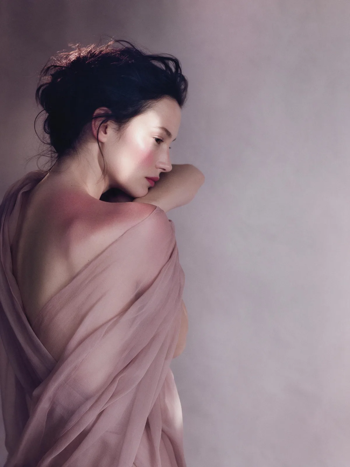
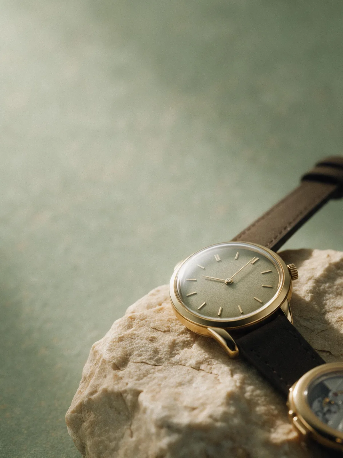
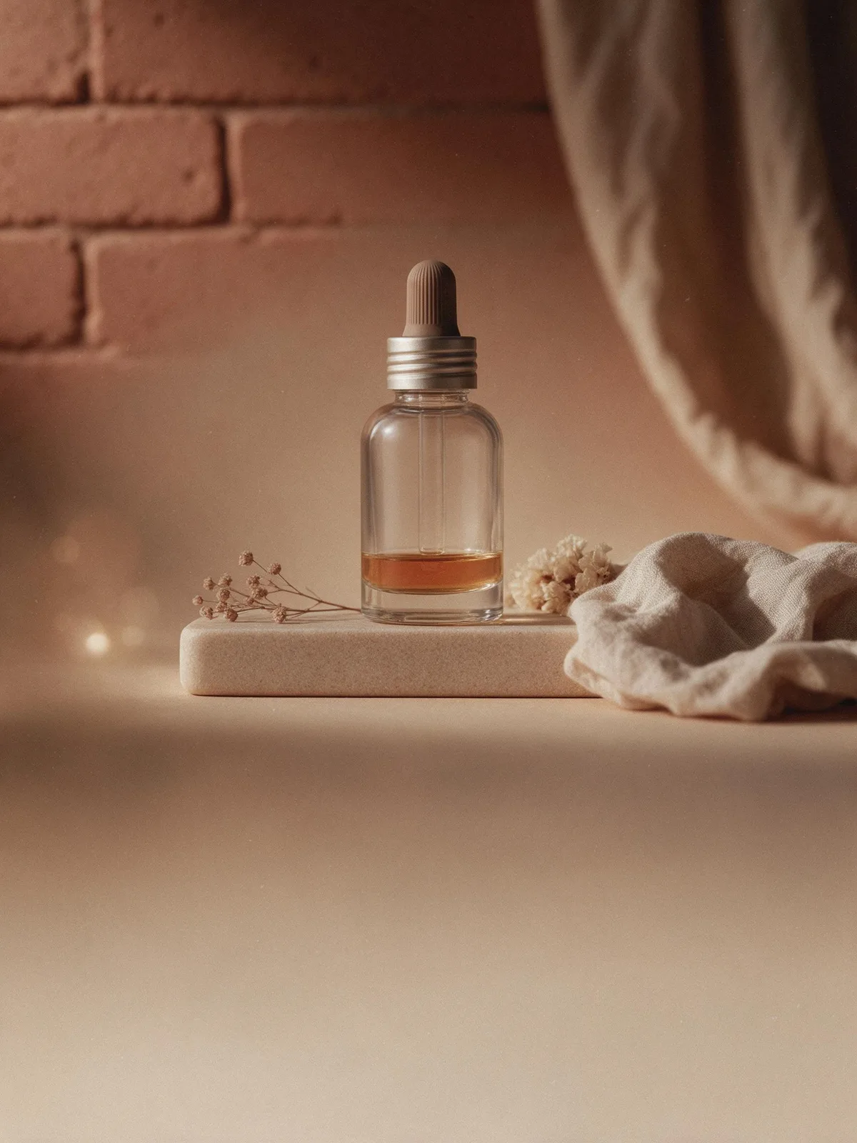
Prompt snippets
luxury fragrance magazine advertisement, portrait of a woman on the left third of the frame, Rembrandt lighting, soft film grain, muted morandi palette of dusty rose and grey, empty right side for the layout, editorial, no text --ar 3:4A luxury fragrance magazine ad: a woman's portrait sits on the left third of the frame, lit with Rembrandt lighting so a small triangle of light falls on her shadowed cheek. Soft film grain, a muted palette of dusty rose and grey, and an empty right side. No text.High-end perfume magazine ad, a female portrait positioned on the left third of the frame, Rembrandt lighting, subtle film grain, Morandi color palette of grey-pink and grey, blank space on the right for layout, no text in the image.
How this look is built
Open in the builder ›An ad look is not one style word but the combination below. Opening it fills the matching slots; the subject is yours to write.
- CompositionRule of ThirdsThe subject is positioned on one side, leaving the other side empty for the layout and copy.
- StyleFilm PhotographyFilm grain and soft highlights are the most common textures in high-fashion editorials.
- LightingRembrandt LightingThe three-dimensionality of Rembrandt lighting is ideal for character-driven brand narratives.
- ColorMorandi ColorsLow-saturation premium greys are the most common tone for magazine ads.
What it is
A magazine ad is a commercial visual format designed specifically for magazine interiors or spreads. Unlike fragmented social media images that aim for quick attention, it relies on the immersive reading experience of print media, emphasizing print-grade refined texture, meticulous lighting, and a strong sense of brand artistry, while strictly reserving space for subsequent text layout.
Visual and emotional effect
Visually, a magazine ad pursues a print-grade refined texture. Colors are typically restrained or highly brand-recognizable, and lighting often employs premium studio setups or carefully arranged natural light. Emotionally, it conveys a sense of distance or aspiration through restrained composition, using large areas of negative space to create a calm, high-end atmosphere that makes readers pause as they flip through the pages.
When to use it
Suitable for brand campaigns featuring high-ticket or aspirational products, such as fashion editorials, beauty, fragrance, and watches. It is the preferred style when a project requires high-quality brand visuals that will later be paired with extensive copy for magazine layouts or promotional brochures.
Prompt tips
Explicitly prompt for “negative space” or “copy space” to allow for layout; include terms like “editorial photography” or “high fashion editorial” to set the tone; add “print magazine style” to reinforce the print media texture.
Common mistakes
Filling the frame with too many elements, leaving no room for text layout in post-production; over-pursuing absolute clarity and centering of the product, which reduces the image to a white background shot or a product manual, stripping it of the artistic mood and visual breathing room expected in a magazine ad.