Co-branding Visual
Co-branding Visual Co-branding Poster Collab Key Visual Brand Collaboration Visual Collab Campaign Visual Co-branded Poster
Brand AdvertisingA visual design specifically created for cross-brand collaborations. By merging the signature elements, materials, or colors of both parties, it creates a commercial visual expression that retains both brand tones while generating buzz and topicality.
Also known as: Co-branding Poster · Collab Key Visual · Brand Collaboration Visual · Collab Campaign Visual · Co-branded Poster
- Midjourney
- Flux
- Dreamina
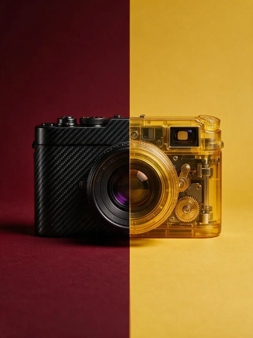
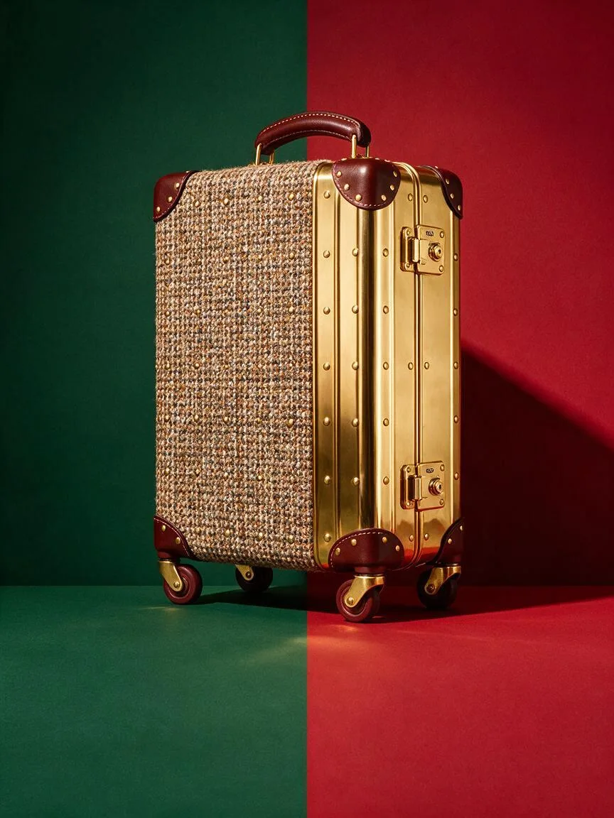
Prompt snippets
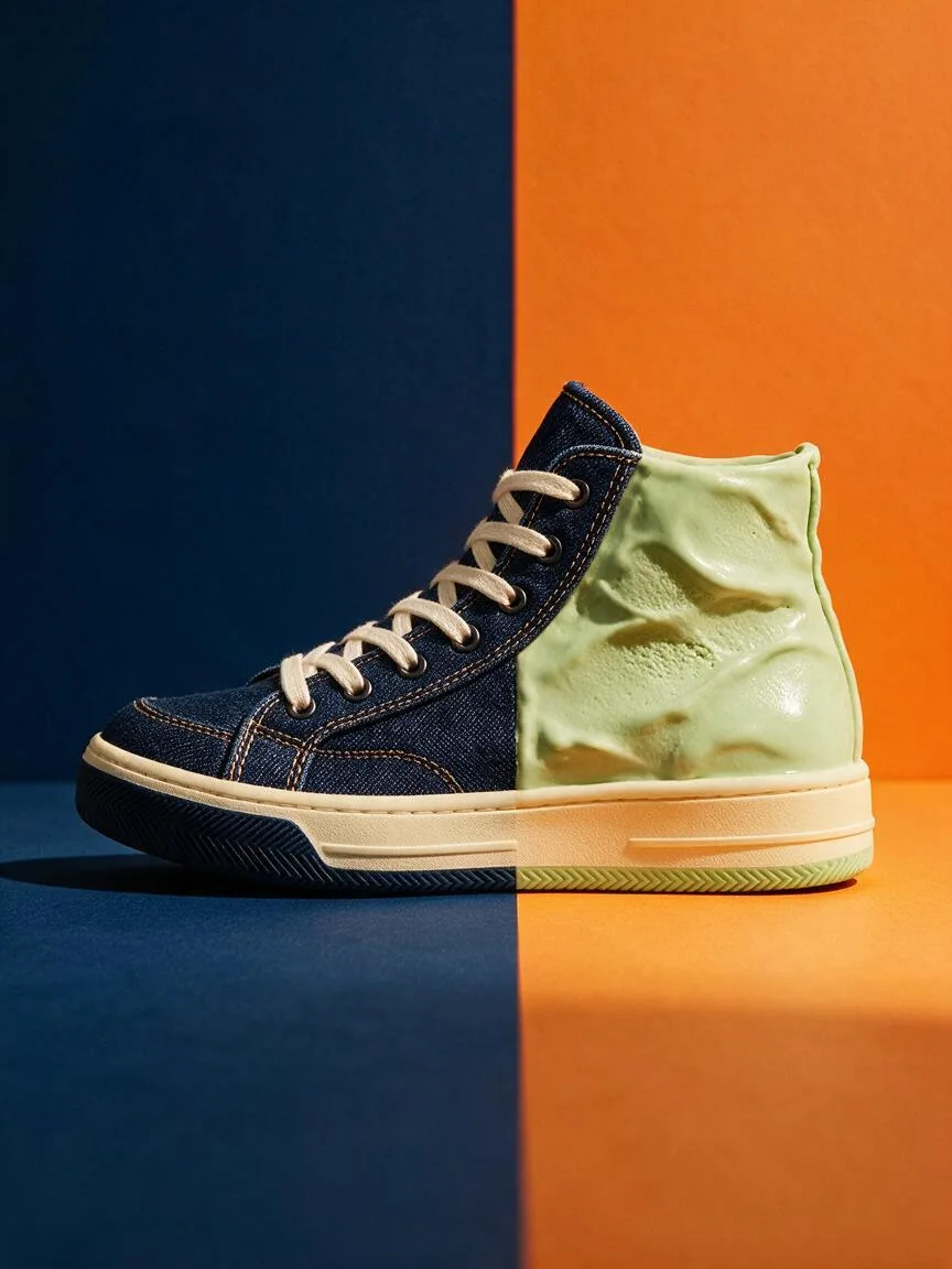
co-branding campaign visual, a high-top sneaker whose upper is half rugged denim and half glossy pistachio ice-cream texture, split symmetrically down the middle, navy blue background on the left and warm orange background on the right, a single crisp hard key light unifying both materials, both backgrounds running to the bottom edge of the frame, the sneaker centered with generous space below it for two logos, no text, no logos --ar 4:5 --style rawA co-branding campaign visual: a high-top sneaker whose upper is half rugged denim and half glossy pistachio ice-cream texture, split symmetrically down the middle. Navy blue background on the left, warm orange on the right. A single crisp hard key light unifies both materials. Both backgrounds run to the bottom edge of the frame, and the sneaker sits centered with generous space below it for two logos. No text, no logos.Co-branding Key Visual, a high-top sneaker with the upper half made of rugged denim and half made of glossy pistachio ice cream texture, split symmetrically down the middle. The left background is navy blue and the right is warm orange. A single crisp hard key light unifies both materials in the same frame. Both background colors extend to the bottom edge of the frame. The sneaker is centered with ample space below for both logos. No text or logos in the image.
How this look is built
Open in the builder ›An ad look is not one style word but the combination below. Opening it fills the matching slots; the subject is yours to write.
- CompositionSymmetrical CompositionElements from both brands are split evenly left and right, so neither overshadows the other.
- LightingHard LightA single set of Hard Light pulls both materials into the same frame, making it look unlike a Collage.
- ColorComplementary ColorsThe main colors of both sides clash as Complementary Colors, creating the most direct sense of collision.
What it is
Co-branding Visual is a visual design specifically created for cross-brand collaborations. Its core lies in finding the visual intersection between brands, cleverly merging their signature elements, materials, or IPs while maintaining their respective tones, to create a visual expression that is both topical and fresh.
Visual and emotional effect
Co-branding visuals typically pursue a strong sense of “collision” or ultimate “harmonious coexistence.” By contrasting materials, colors, or styles (such as street graffiti with haute couture), they create visual impact; or they deconstruct and reassemble classic symbols from both sides to form a new super symbol. The image is highly recognizable, conveying emotions of innovation, breaking boundaries, and the scarcity of limited editions.
When to use it
- New product launches: Teaser and launch Key Visuals for co-branded products (apparel, beauty, digital devices, etc.).
- Marketing campaigns: Online and offline materials for holiday exclusives, anniversaries, or cross-brand pop-up stores.
- Social media distribution: Creative Concept Posters used to generate buzz and encourage organic sharing by fans.
Prompt tips
- Material and element blending: Avoid mentioning brand names directly; instead, describe “Material of A + Style of B”. For example, “rugged denim material fused with delicate haute couture lace texture”.
- Reserve layout space: Co-branding must display both logos. Include
negative spaceorminimalist backgroundin the prompt to leave room for post-production layout. - Unified lighting: Use
dramatic studio lightingor a unified color palette to govern different elements, preventing the image from looking like a rigid Collage.
Common mistakes
- Element clutter: Trying to cram in all classic elements from both sides, resulting in a scattered visual focus.
- Ignoring layout space: AI-generated images are too crowded, leaving no breathing room for the combined logos (Lockup) of both parties.
- Disjointed styles: Forcibly splicing incompatible styles without unified lighting and color transitions, causing the image to lose its overall cohesion.