Bauhaus
Bauhaus Bauhaus Style Bauhaus Poster
Image StylesA modern design language originating from the Bauhaus school in Weimar, Germany in 1919: geometric shapes, primary colors (red, yellow, blue), grid typography, and sans-serif fonts, emphasizing form follows function.
Also known as: Bauhaus Style · Bauhaus Poster
- Midjourney
- Stable Diffusion
- Flux
- Dreamina
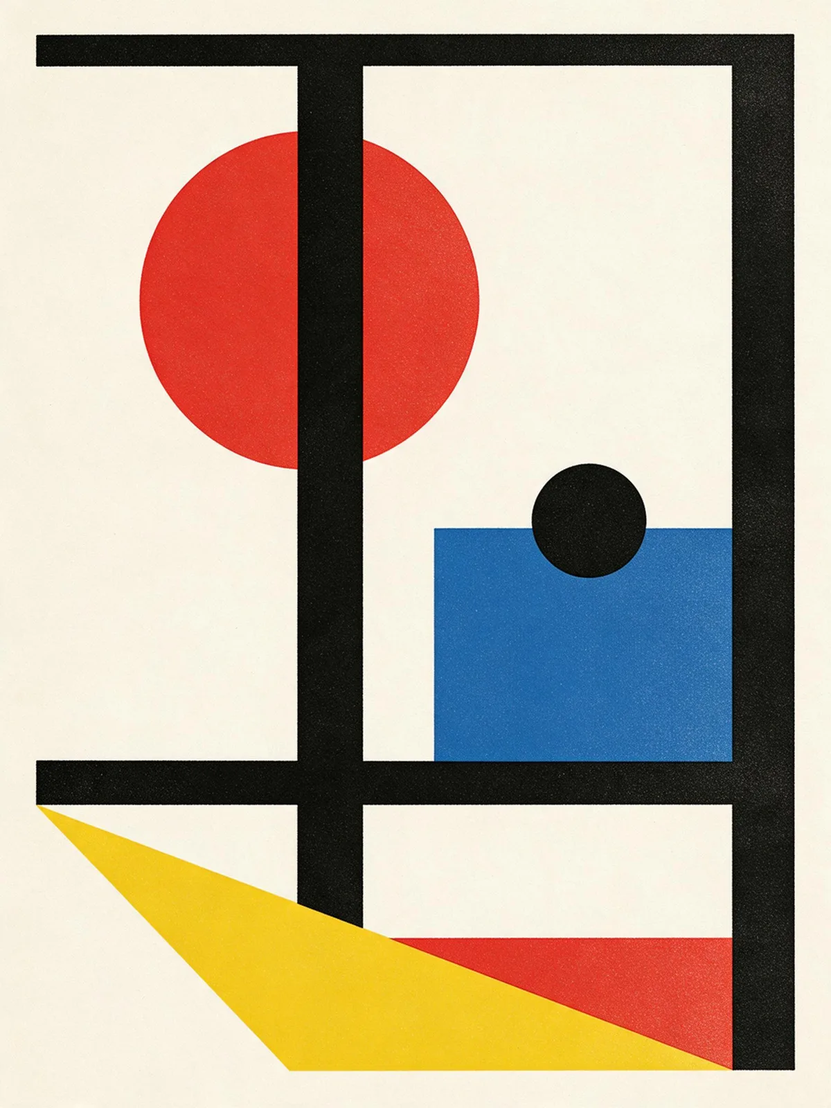
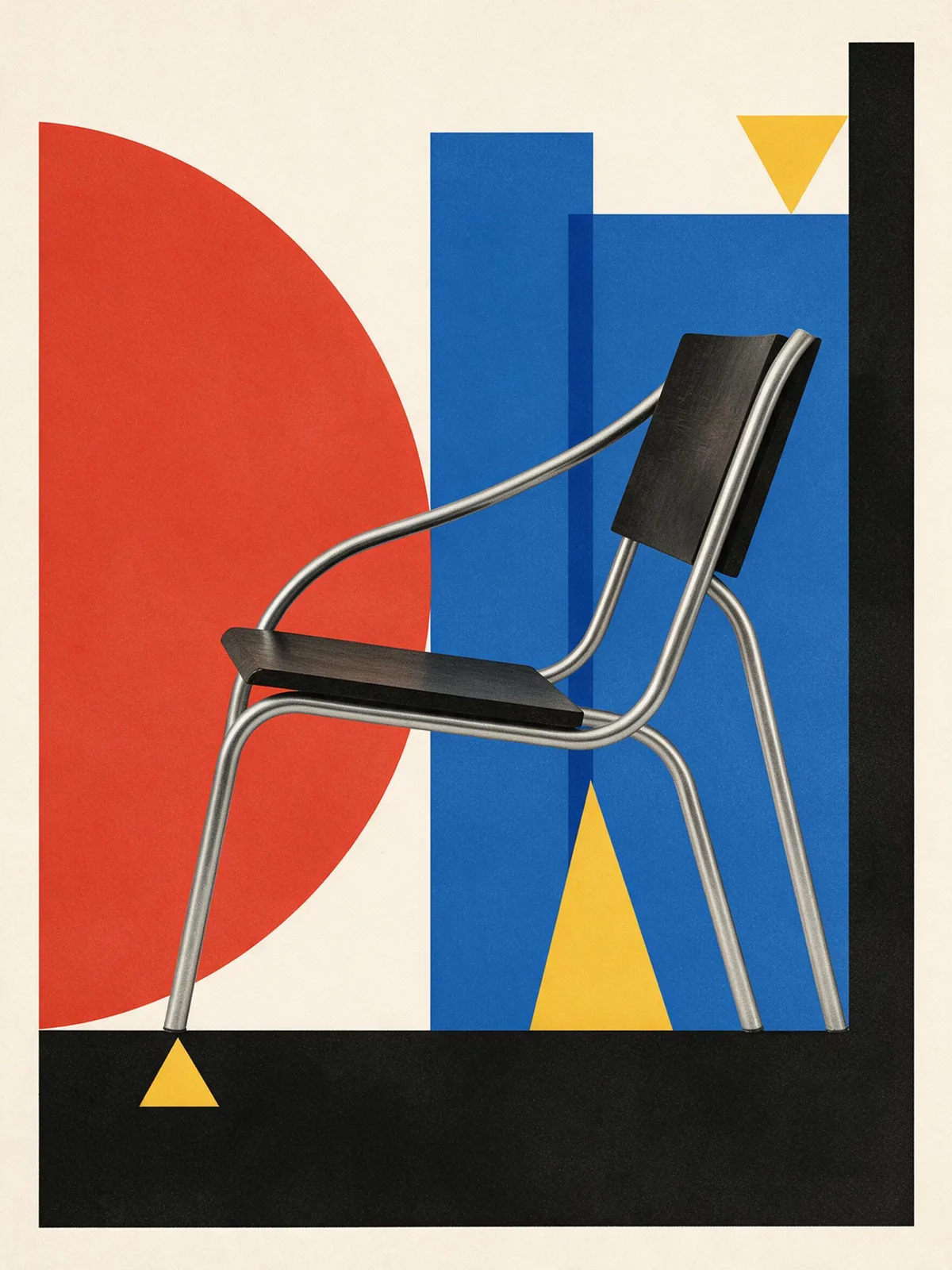
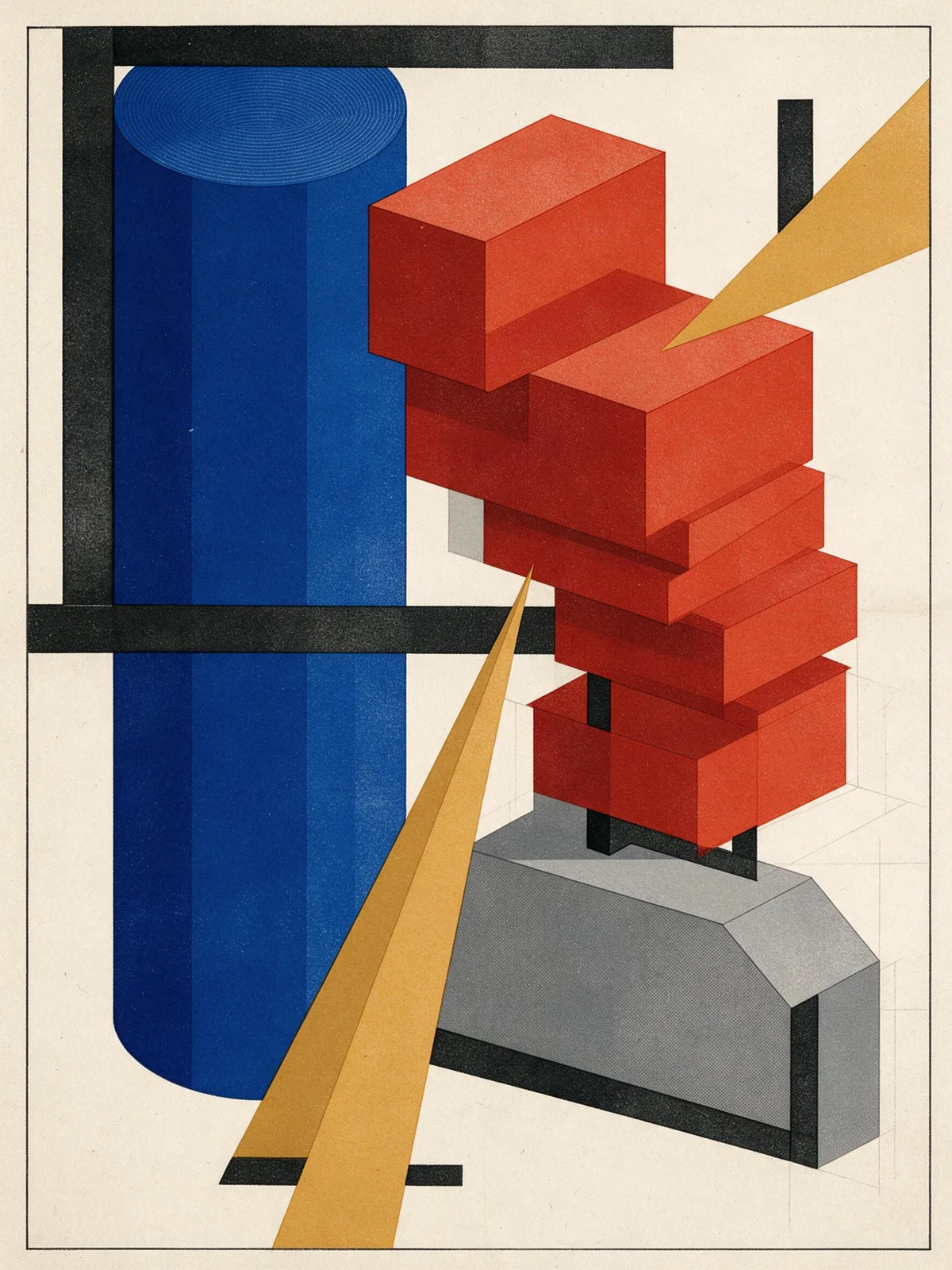
Prompt snippets
Bauhaus poster composition, a large red circle, a blue square and a yellow triangle locked to an asymmetric grid, heavy black bars, flat printed color, off-white paper, screen print texture, no text, no lettering --ar 3:4 --style rawbauhaus graphic composition, red yellow blue, asymmetric grid, thick black bars, flat geometric shapes, screen print textureA Bauhaus composition on cream paper: a large red circle overlapping a blue square, a small yellow triangle, and two heavy black bars dividing the page on an asymmetric grid. Flat printed color, no words or lettering anywhere.Bauhaus style flat composition, cream paper background, primary colors red yellow and blue, large circles squares and triangles, asymmetric grid, thick black bars, flat printed texture, no text or lettering anywhere in the image
What it is
Bauhaus was originally a school: founded in Weimar, Germany in 1919 by architect Walter Gropius, moved to Dessau in 1925, and closed in 1933 under Nazi pressure. Wassily Kandinsky, Paul Klee, László Moholy-Nagy, and Josef Albers all taught here. It combined art with industrial production and later became one of the sources of modernist design. Today, the “Bauhaus style” primarily refers to its graphic visual language: basic geometric shapes, primary colors (red, yellow, blue) plus black and white, asymmetric grids, and sans-serif typography.
Visual and emotional effect
- Rational and restrained: The composition consists of a few geometric blocks without unnecessary decoration.
- Strong composition: Large areas of solid color blocks and thick black lines make the poster striking even from a distance.
- Retro yet modern: It carries a historical feel from the early 20th century, but remains timeless when applied to today’s interfaces and branding.
When to use it
- Posters for exhibitions, lectures, and music festivals
- Cover images that require a “design sense” without relying on specific characters or scenes
- Geometric auxiliary graphics in brand visual identity
Prompt tips
- Basic combination:
Bauhaus poster, primary colors, geometric shapes, grid layout. - Add material details:
flat color,screen print texture,off-white paperto prevent the model from adding 3D lighting and shadows. - For Midjourney, add
--style rawand lower--stylizefor a flatter, more structured look; use--ar 3:4for poster proportions. - For Stable Diffusion, exclude
photorealistic, 3d render, gradientin the negative prompt.
Common mistakes
- When only writing
Bauhaus, the model might generate the Bauhaus school building instead of a graphic poster. Specifyposterorgraphic design. - Using too many colors: red, yellow, blue, plus black and white are enough. Adding pink or purple gradients will make it look more like Memphis Design or Vaporwave.
- AI-generated lettering is mostly unusable. For formal materials, it is recommended to add text in post-production.
The swatches above are SVG approximations; actual generated results will vary depending on the model used.