前后对比图
Before and After
Before and After 前后对比 效果对比图 使用前后对比 Before and After Image Before After Comparison Split Comparison
电商视觉在电商视觉中,把产品使用前后的状态并排放进同一画面,用直观的反差证明产品功效的图片格式。
又称:前后对比 · 效果对比图 · 使用前后对比 · Before and After Image · Before After Comparison · Split Comparison
- Midjourney
- Flux
- 即梦
Prompt 片段
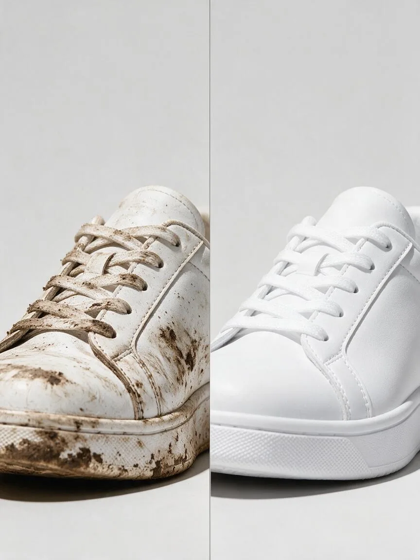
split-screen before and after image of the same white sneaker from an identical angle, left half muddy and scuffed, right half spotless and bright white, a thin vertical divider line in the middle, identical framing and lighting on both halves, bright even high-key light, plain light grey background, no text, no labels --ar 1:1 --style rawA split-screen before and after image of the same white sneaker from an identical angle: the left half is muddy and scuffed, the right half spotless and bright white, with a thin vertical divider line in the middle. Framing and lighting are identical on both halves, in bright, even high-key light on a plain light grey background. No text, no labels.左右分屏的前后对比图,同一只白色运动鞋、完全相同的角度,左半边沾满泥污和划痕,右半边洁白如新,中间一条细竖线分隔,两半构图和光线完全一致,明亮均匀的高调光,浅灰色纯背景,画面中不要出现文字和标签
这套画面怎么拼
在拼装器里打开 ›广告画面不是一个风格词,而是下面这几个词的组合。点开会自动填进对应槽位,主体留给你自己写。
- 构图对称构图Symmetrical Composition左右两半同机位、同构图,差别只剩效果本身
- 风格极简主义Minimalism背景和道具都去掉,视线只落在变化上
- 光线高调照明High-Key Lighting两半用同一套明亮均匀的光,免得被说成靠打光
是什么
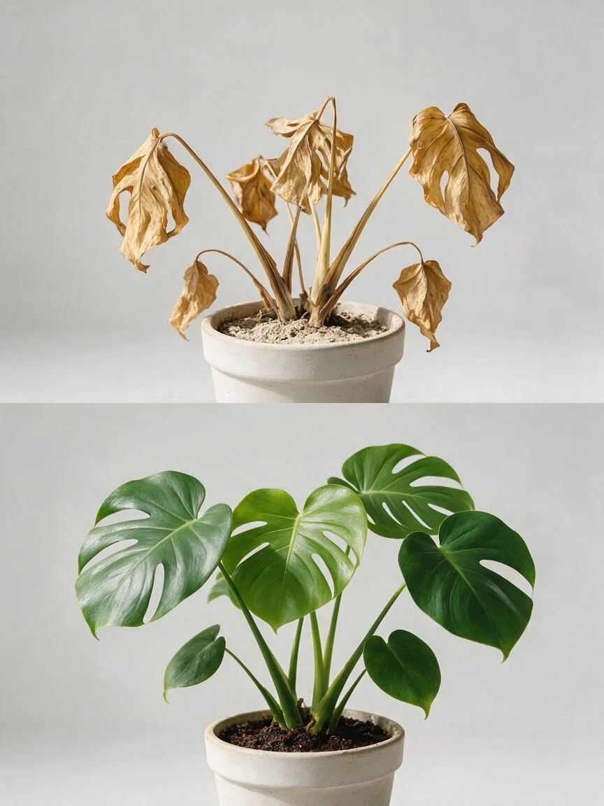
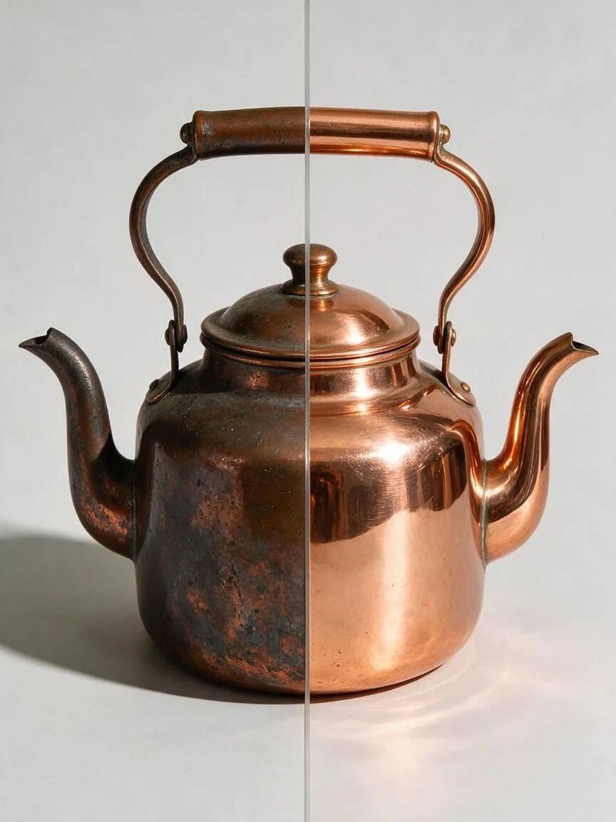
前后对比图(Before and After Image)是电商视觉中通过并排或同屏展示产品使用前后的状态差异,以直观呈现产品功效的图像格式。它常用于美妆、清洁、健身、修复等强功效导向的品类。
视觉与情绪效果
通过强烈的视觉反差(如脏污与洁净、暗沉与透亮),瞬间抓住用户眼球。这种格式能直接触发用户的“结果预期”,有效降低认知成本,建立对产品功效的信任感,从而提升转化率。
什么时候用
适用于需要证明产品“改变现状”能力的场景。如护肤品详情页的肤质改善、清洁剂的去污效果展示、家具修复产品的翻新效果等。不适合仅强调外观设计的服饰或 3C 数码产品。
写 Prompt 的技巧
- 明确分割方式:使用 split screen、side-by-side 等词汇限定画面布局。
- 保持主体一致:强调 same product、identical angle,确保前后主体在位置、大小、角度上完全一致,避免产生“偷换概念”的错觉。
- 突出反差细节:具体描述前后的状态差异(如 dull skin vs glowing skin),让 AI 生成更具对比度的细节。
常见误区
- 主体不匹配:AI 容易在生成对比图时改变产品的角度或光影,导致前后看起来不是同一个物品。需通过局部重绘(Inpainting)或后期拼接修正。
- 违背平台规则:部分电商平台(如特定美妆、医疗器械类目)严禁使用夸张的前后对比图,制作前需确认平台合规要求。